It's safe to say I buy far to much based on the way it looks, especially when it comes to food packaging and although not everyone is as easily persuaded, it plays a massive part in the reason we buy products.
This area of design is constantly evolving to meet the current needs and beliefs of the consumer and our wider culture. The main aim is to ensure a product stands out amongst the crowd. Which can be a tricky task especially when there's plenty of competition.
This list is isn't in any particular order and showcases just a few of the innovative and inspirational packaging design examples I have seen so far this year. They all make use of trends within the industry and understand both what we want and need as consumers.
So if you're interested in packaging design, are looking for some inspiration and want to learn more about packaging trends in 2018 let's get cracking!
1. Co-Op

This project shakes up the convention of own brand packaging for supermarkets. We're used to seeing striped back, budget designs but Co-Op asked agency Robot Food to re-imagine the packaging for their entire alcohol range.
The range is cleverly tied together through a limited colour pallet (which also connects the range to Co-Op's wider brand identity.) Plus consistent use of modern yet ornate typography.

This range of own brand products definitely competes for our attention against their branded counterparts and breaks the convention of own brand looking budget.
This bold use of big and extravagant type is a trend I have been seeing a lot of on packaging design so far this year. Traditionally food packaging uses image or illustration elements to communicate with a viewer so using text could be a clever way to ensure a product stands out!
2. Brandless


Brandless is a company dedicated to 'stripping away brand labels and treating products equally' and this goal has lead them to some pretty innovative packaging design.
Design studio Red Antler, created a trade mark White Box which ties together all aspects of the brand and acts as a logo for the 'brand'. So essentially they have built a brand out of negative space!
This packaging puts the product and consumer first but the practical designs never feels boring. Instead they are uncluttered and communicate effectively.

3. Cornetto

Cornetto's are pretty nostalgic for a lot of people and re packaging this kind of product can be tricky.
The product needed an update, but somtimes it's not necessary to totally start over.
Here the style and packaging has been brought into the 21st century. The designers have simplified the design down to the most essential and interesting assets, introduced subtle photographic elements and used gold foiling on the word 'classico.' Foiling is another popular process cropping up in packaging design this year!

4. Craft Gin Club - Gin subscription box
Here we have a great example of minimal design but with a great impact. I think most of us would love to receive this in the post?
There has been a big trend this year toward 'doodles' or unrefined illustrations being used on packaging. In this case the botanicals usually used to create Gin are featured as simple, bold colourful illustrations which don't give to much away and leave you intrigued to open the box!
The colour pallet is bright and kept to three colours so doesn't feel overwhelming, it also feels fresh, summary and excited to see what surprise you will get inside! It's great to see the set of illustrations used throughout the brand, they make up the logo, are used on products and even on marketing materials.
The design of this packaging pulls from the brands roots and is based on titles in Milan's Duomo/Cathedral. This clever use of pattern is not just a nod to the heritage of the company but helps to define the difference between the three products they offer.
The patterns are structured similarity but all use colour and shape just differently enough to tell them apart.
The idea was to stand out against other plainer competitors but still be relatable to families.
Instead of using imagery or illustrations related to coffee like most similar brands Volcano At Home an ethically traded coffee range, decided to play on the fact the coffee is housed in pods and create playful illustrations which advertise this.
The minimal approach steps away from tradition. This brings a sense of character and style to the product. Along with the use of dyed uncoated boards and block foiling this brand looks luxurious but not pretentious. This is another beautiful example of foiling being used in packaging design!


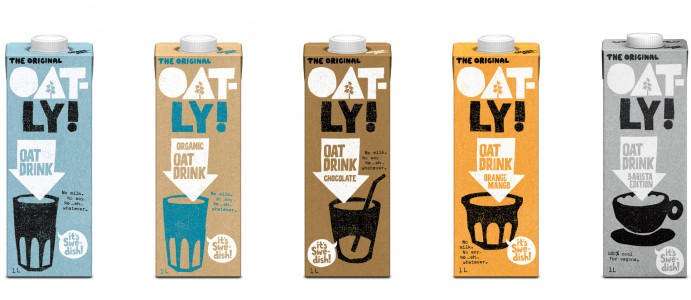
Oatly is definitely a company a lot of people are talking about. The product is so popular a few months ago they actually ran out of oats!
For me and I would bet at least a few other people the packaging was 100% what made me try it!
The muted colour pallet coupled with organic and textured text and raw illustrations work perfectly to set the right tone for the brand.
They have created a system which works across the range of products. This means they look comfortable lined up together but never ordinary when spotted on a supermarket shelf.
It's also worth checking out their copy writing if you get the chance to pick one up!
8. Liberty (own food range)

This year Liberty launched their first 'own brand' food range. Similar to Co-Op the idea behind the packaging was to stay away from stuffy own brand conventions.
The collection an accumulation of Liberties favourite food producers in the uk. Instead of simply white collaring (removing knowledge of the suppliers) all of the products they wanted to celebrate the individual story of everything in the new line.


To do this they kept a visual theme of 'wild and wacky' across the board to unite the products. So although they are all designed by different illustrators they worked under one art director and all have just the right tone of voice to work as a product range.
9. Granolife
This project is a great example of the trend towards photography being used creatively in food packaging. Which helps the consumer relate to the brand and to what they are buying.
The minimal nature of these designs works perfectly with the product and tone of voice the company is looking to communicate. Simple, great quality, no fuss, honest health food.
The materials and form of the packaging compliment the idea that this brand fits easily into your lifestyle.


10. Cacao 70
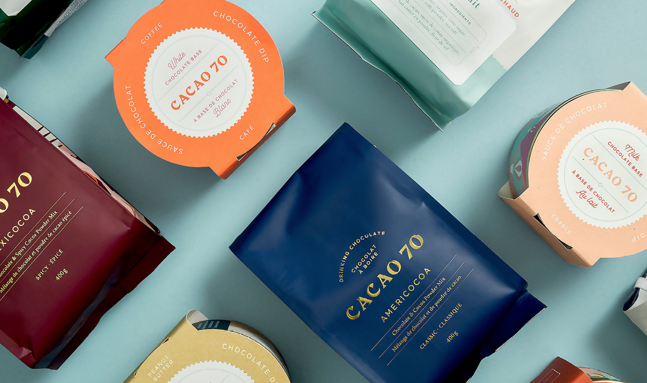
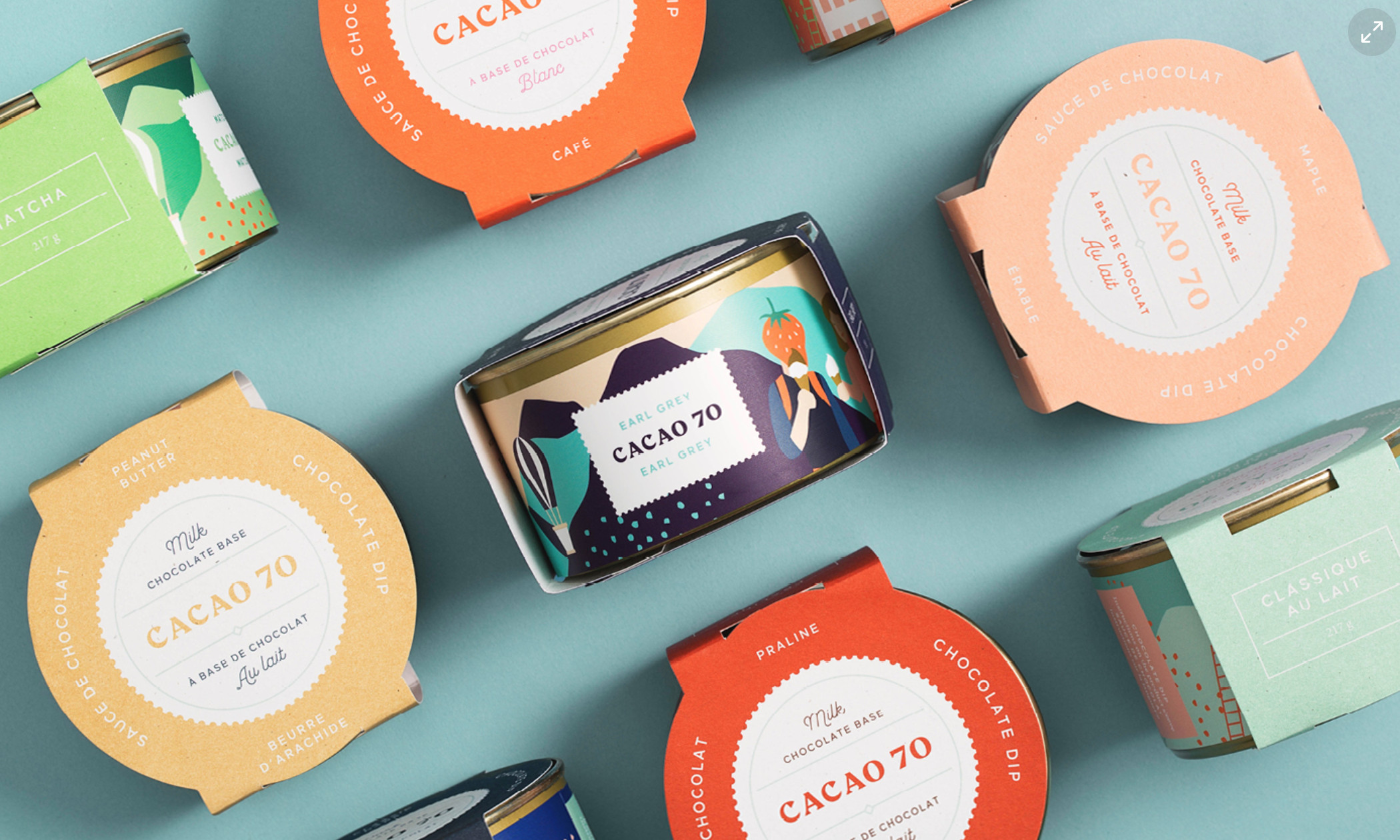
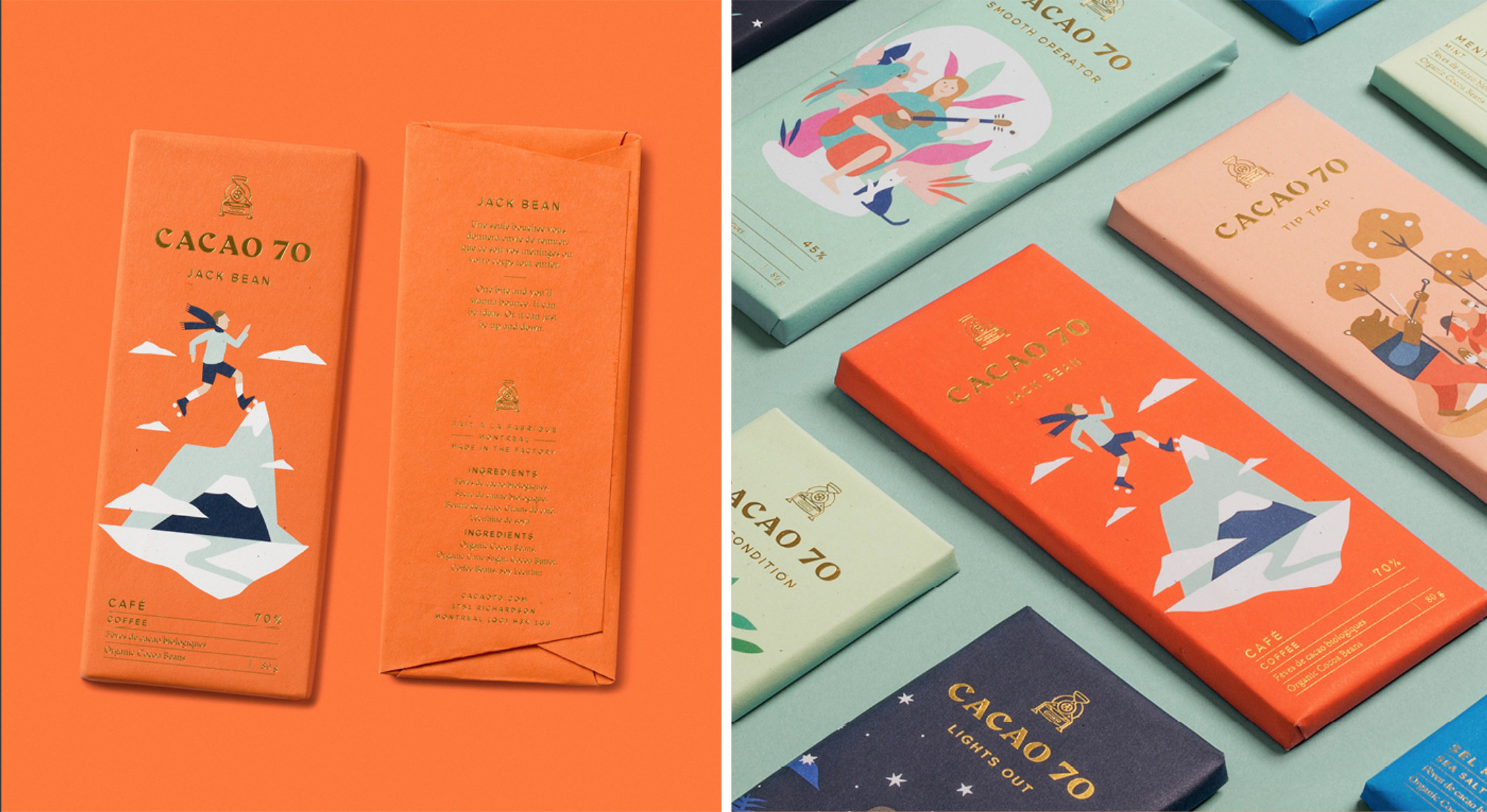
No food packaging showcase is complete without chocolate and Cacao 70 deal with everything chocolate related! Early this year they rebranded and rethought the packaging of their whole product range.
The idea was to create something which felt closer to an experience than a piece of packaging. This is achieved through the mini stories told on each bar with a combination of illustration and information about the qualities of the chocolate. So if you want to be full of beans running up a mountain or relaxing under the stars there is a flavour to suit!


This aim is present throughout their whole range of products and in the larger business where customers experience the brand in store. The idea of chocolate as escapism is something we are used to seeing as consumers. However this brand takes it a step further by suggesting it will help you step into another world/experience...they call it the “State of Chocolate”.
It was pretty difficult to choose just 10 projects to include in this post. There's plenty of amazing work out there to find and we are always on the look out for interesting projects so if you have any of your own favourites then let us know!
If this is a topic you are particularly interested in keep an eye on latest packaging design projects here and here.
Or if you want to keep reading here another of our recent posts.


