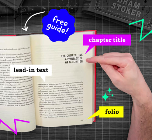
When we think of book design, our minds often jump to the cover, the fonts, or even the layout. While the cover design is very crucial, for designers, understanding the full anatomy of a book is fundamental to creating something functional, aesthetic, and timeless!
In this blog post, we’ll dive into the essential elements of book design and provide a free downloadable guide to help you master the terminology and techniques like a pro!
If you haven't already, be sure to check out our latest tutorial on Anatomy of Books for a deep understanding of all the terms used in book design using real examples!
Let's dive into Why Understanding Book Anatomy Matters
Designing a book is not just about aesthetics—it’s about usability. Every element, from the margins to the spine, serves a functional purpose. A well-designed book ensures the reader's experience is seamless, the text is easy to read, and the overall design aligns with the book’s tone and purpose.
Here are three key elements of book anatomy that every designer should know.
1. The Cover: The Reader’s First Impression
The cover is the face of the book, and it’s divided into several parts:
- Front Cover: Features the book's title, author, and sometimes an image or illustration. Its purpose is to grab attention.
- Spine: Displays the book title and author, essential for shelving and identification.
- Back Cover: Often includes a blurb, endorsements, and ISBN.

Book Cover Design Examples by our Pro Member Students taken from our Book Cover design brief
Design Tip: Ensure the cover art resonates with the book's genre and target audience. For example, a thriller might demand bold, stark typography, while a memoir may require subtle, personal imagery.
2. The Interior: Beyond the cover
The interior of the book involves critical design choices that affect readability and flow. Here are the primary elements:
a. Front Matter
The content before the main text begins. This typically includes:
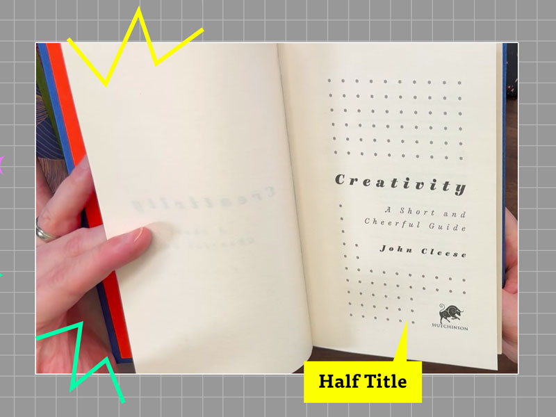
Title Page: Displays the title, subtitle, and author name.
Copyright Page: Includes legal information and publication details.
Table of Contents (TOC): A roadmap for the reader, especially important for non-fiction.
Dedication/Acknowledgments: Optional but common.

b. Body Matter
This is the main core body of the book. Pay attention to:
Margins: These create breathing room around the text. Avoid overly narrow margins to prevent cramped layouts.
Typeface: Choose legible fonts. Serif fonts are traditional for novels, while sans-serif fonts may work for modern
non-fiction.Line Spacing and Alignment: Maintain enough space between lines for ease of reading.
c. Back Matter
The section after the main content, which may include:
Appendices: Extra information supporting the main text.
Glossary: Definitions for specialized terms.
Index: A search tool for the reader, especially useful in academic or reference works.
3. Binding and Printing Considerations
Understanding bookbinding and how it affects design is crucial. Some key terms include:
Gutter: The inner margin near the spine, which must accommodate the bookbinding.
Trim Size: The final dimensions of the book after it’s been cut to size. Common sizes include 5.5” x 8.5” for novels and 6” x 9” for non-fiction.
Don't forget you can get the full terms and definition Guide Here!
