Understanding the technical terms can often seem like a foreign language when entering the world of Graphic Design even for many experienced designers.
Today we will unlock 25 common terms every designer needs to know no matter their skill level. Whether you are designing a brochure in InDesign, editing a photo in Photoshop, or creating a logo using Illustrator, you are sure to come across some of these terms.
Before we begin! Why not test your design theory knowledge first?
Take our Design Theory quiz and get instant access over 100 design terms! ( you will need to create a free account to access the quiz and PDF Guide!
Let's dive in!
1. Artboard
The working area in Adobe Illustrator is called an Artboard. In Adobe Illustrator you can use Artboards to organize your artwork and save or print them out. Artboards are also available in Adobe Photoshop.
2. Composition
In visual arts, particularly painting, illustration, graphic design or photography, composition refers to the placement or arrangement of visual elements on a blank page/canvas. These elements are often arranged using the design rules and theory principles! You can learn more about Principles of design here!
3. Bad registration
When all of the printing colors don’t align properly, that is referred to as a registration issue.
4. Bleed
An extra 3mm or 1/8” (0.125 in) of image or background color that extends beyond the trim area of your printing piece. Set up document bleeding in less than a minute!
5. Body copy
Text forming the main content of a book, magazine, web page, or any other printed or digital work.
6. Canvas
The working area in Adobe Photoshop is called a Canvas, which can be extended or reduced to fit more image content into the document.
7. Color
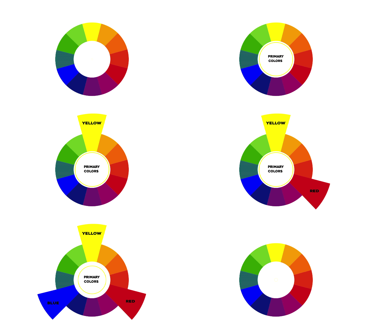
In Graphic Design, It is impossible to design anything without colors. Every color has its own meaning and each color describes a different purpose and idea. Creative often use the color wheel as a guide on understanding how to pair colors well that's visually effective. There are many color pairing such as Complementary colors, Triad, Analogous! You can learn more on Color Wheel and Pairing here. You may also like this post on Colour combinations every designer should use!

8. CMYK
CMYK refers to the four inks used in some color printing: Cyan, Magenta, Yellow, and Key (Black). CMKY color mode is best for any artwork that is going to be printed. These four colors are all mixed together in different percentages to create all the different colors we see in print. This is why CMYK is also referred to as the 'four-color process.'

Want to learn more on Color Modes? Check out our post on CMYK vs RGB. What's the difference?
9. Creep / Shingling
Inside margin of a book, magazine or other publication. Want to learn more on editorial designs? Check out our tutorial's below!
10. Entry point
Provide readers with multiple eye catching moments in your layout that might draw them in to read more.
11. Gestalt principles
Describe how viewers group different objects and elements together into a single, coherent whole if disparate elements are arranged in a particular way.
12. Intro / Stand-first / Deck
Acts as a bridge between headline and body copy.
13. Kerning
In typography, kerning refers to the adjustment of spacing between individual characters (letters, numbers, punctuation) to improve visual appearance and readability.
Want to learn how to Kern your text in a fun way? check out our post on 7 Games that will teach you Graphic Design


14. Layout
Master plan or blueprint of a printed or published work (such as an advertisement, book, magazine, newspaper, or website) that lays out the arrangement of its different graphic elements (such as body copy, colors, headlines, illustrations, scale). It establishes the overall appearance, relative importance, and relationships between the graphic elements to achieve a smooth flow of information (message) and eye movement for maximum effectiveness or impact. Often alternative layouts (called roughs) are prepared to explore different arrangements before the final layout is made for printing or production.
To create awesome layouts - you may enjoy this post 5 Golden Rules that will improve your designs
15. Leading
The distance between lines of text. An important setting that affects readability of copy.
16. Masking
Using masking techniques, you can reveal or hide details in an image. Discover how to use masking in Adobe Photoshop, Illustrator, and InDesign!
17. Mock-up
Mock-ups are used by designers to show how the finished product will look, Mock-up can be static or interactive and is a great way to get feedback from clients or team members and lastly make your portfolio look professional.
18. Negative space
The space not occupied by the text or images. Negative or white space has the same importance as the text and images on the layout. Without proper use of negative space the design will look messy and crowded.
Learn how to incorporate negative space into your designs by watching our tutorial below
19. Rule of thirds
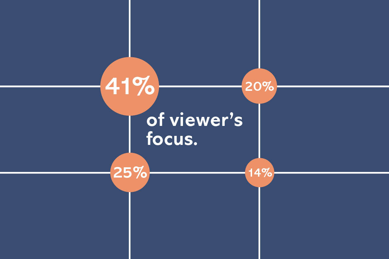
Divide your design into three rows and three columns. The points where the vertical and horizontal lines meet form natural guidelines for where you should place your subject and supporting elements. Learn more on rule of thirds here!


20. River
Gaps in typesetting which appear to run vertically through a paragraph of text due to a coincidental alignment of spaces.
21. Serif
A short line or finishing stroke that crosses or projects from stems or strokes in a character.
Are you interested in learning more about typography and font pairings? Take a look at the tutorials below!
22. Stock photo
Stock photos (stock photography) are professional photographs of common places, landmarks, nature, events or people that are bought and sold on a royalty-free basis and can be used and reused for commercial design purposes.
Searching for the best stock photography sites? Check out our post on the best FREE resources for graphic designers and illustrators
23. Spot color
Pre-mixed ink that is applied in a single pass whereas CMYK inks are layered on four passes to mix the correct colour.
24. User flow
A diagram that shows at a glance, the path your user will take through your app or website to achieve a certain goal.
25. X-height
The height of the lowercase letters, disregarding ascenders or descenders, typically exemplified by the letter x. Learn more about Type Anatomy here!

Unlock over 100 Design terms and definitions!
Sign up to take our Design Quiz today! And Unlock over 100 design terms and definitions!


