Updated August 2025
Typography is a pretty vast subject. What makes it even harder to master are the many unusual terms used to describe the way text is handled/created!
Today we want to introduce you to the topic of Type Anatomy and to familiarise you with some of these odd typographic terms!
The term character refers to an individual letter, numeral or punctuation mark. Uppercase letters are called 'caps/uppercase characters.' Then small letters are 'called lowercase characters.' All characters no matter what classification or typeface can be broken down into smaller elements. Just like putting individual puzzle pieces together to create the whole picture.
Understanding the anatomy of typography and the way letterforms are put together will help you understand characters relationships to one another.
So when you're working with words/sentences you will know how to optimise readability for the viewer. Which is usually the most important factor when it comes to working with text. Always question if it's easy to navigate and understand for the viewer? If copy is a struggle to read it will struggle to communicate a message.
Plus as you learn about other areas of typography for example: how to set a body of text, how to pair several different type faces, how to manipulate/customise a typeface or even develop you're own understanding the anatomy of letters will provide a solid foundation to work on.
This makes it easy to and pick up new terms and techniques. So soon you will love working with type as much as I do...
well maybe!
So let's get started...
First off let's take a deeper look at the shapes/forms which make up individual characters.
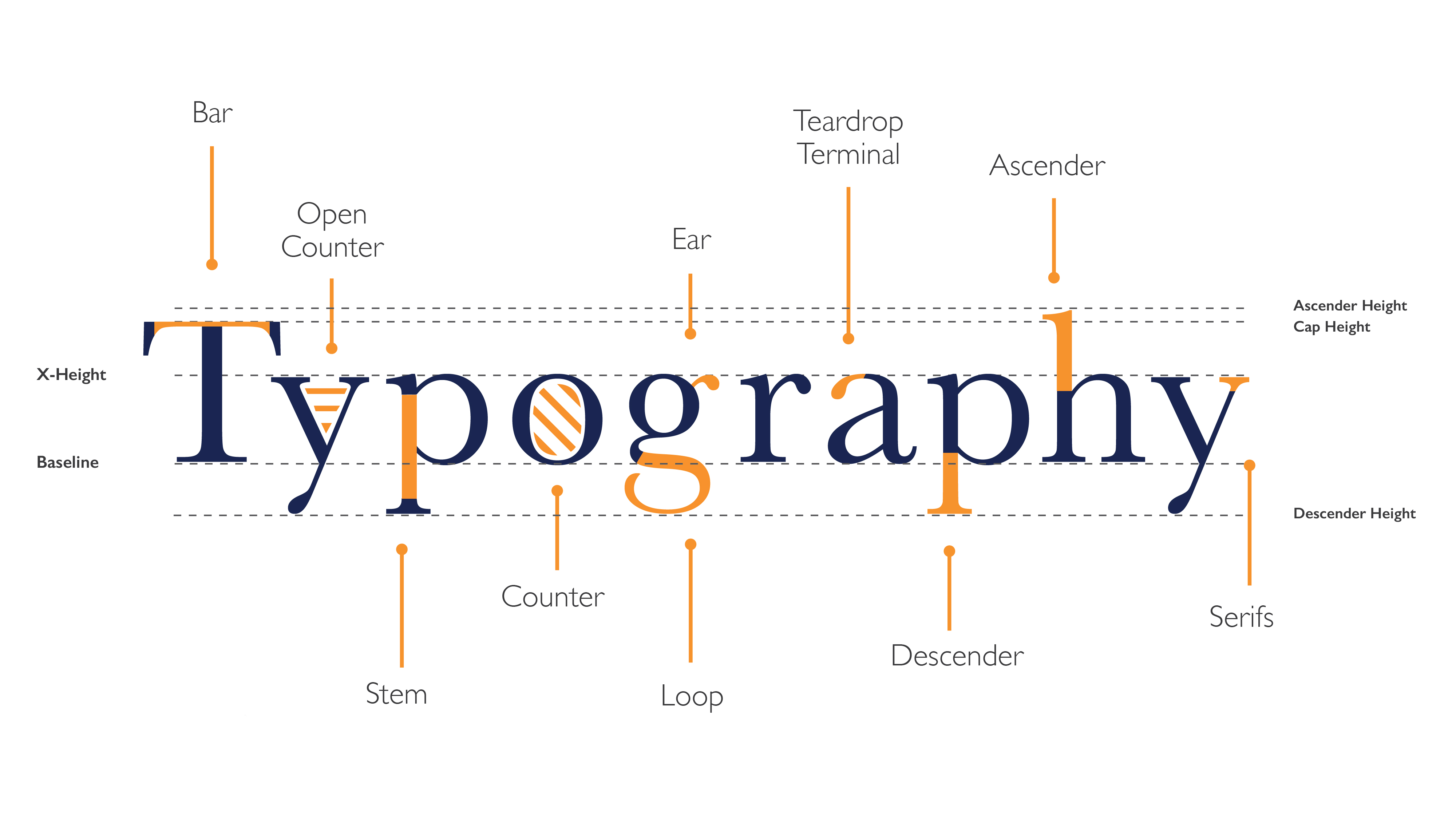
Bar
The horizontal stroke in letters. Also known as a Crossbar. These help to form the main structure of a lot of letters.
Open Counter
The partially open space within a character that is open on one end. Also see 'Counter' below.
Ear
A small stroke extending from the upper-right side of the bowl of a lowercase g. Can also appear in a curved lowercase r.
Teardrop Terminal
The appearance
of dropped-ends on the end of some strokes.
Ascender
An upward vertical stroke. Found on lowercase letters which extends
above the typeface’s
x-height.
Stem
The vertical,
full-length stroke which appears in upright characters. These help to form the main structure of many letters.
Counter
The open or negative space in a fully closed area within a character. Spot 5 examples above.
Loop
The enclosed/partially enclosed counter below the baseline of a double-story g.
Descender
A downward vertical stroke. Found on lowercase letters and extends below the typeface’s baseline.
Serif
A stroke/small decorative line added as embellishment to the form of a character.
Hopefully that gave you some useful information on the way characters are structured!
So now I want to explain a few terms you many have already come across like, X- Height, Baseline, Cap Height etc.
These terms refer to various lines/ boundaries we use to organise characters into words so they look balanced, well structured and consistent. Words which have been 'set' (or organised) correctly are not only easier to work with when they become sentences or paragraphs but can actually be used to communicate a message. Something you will discover more and more as you start to work with type!
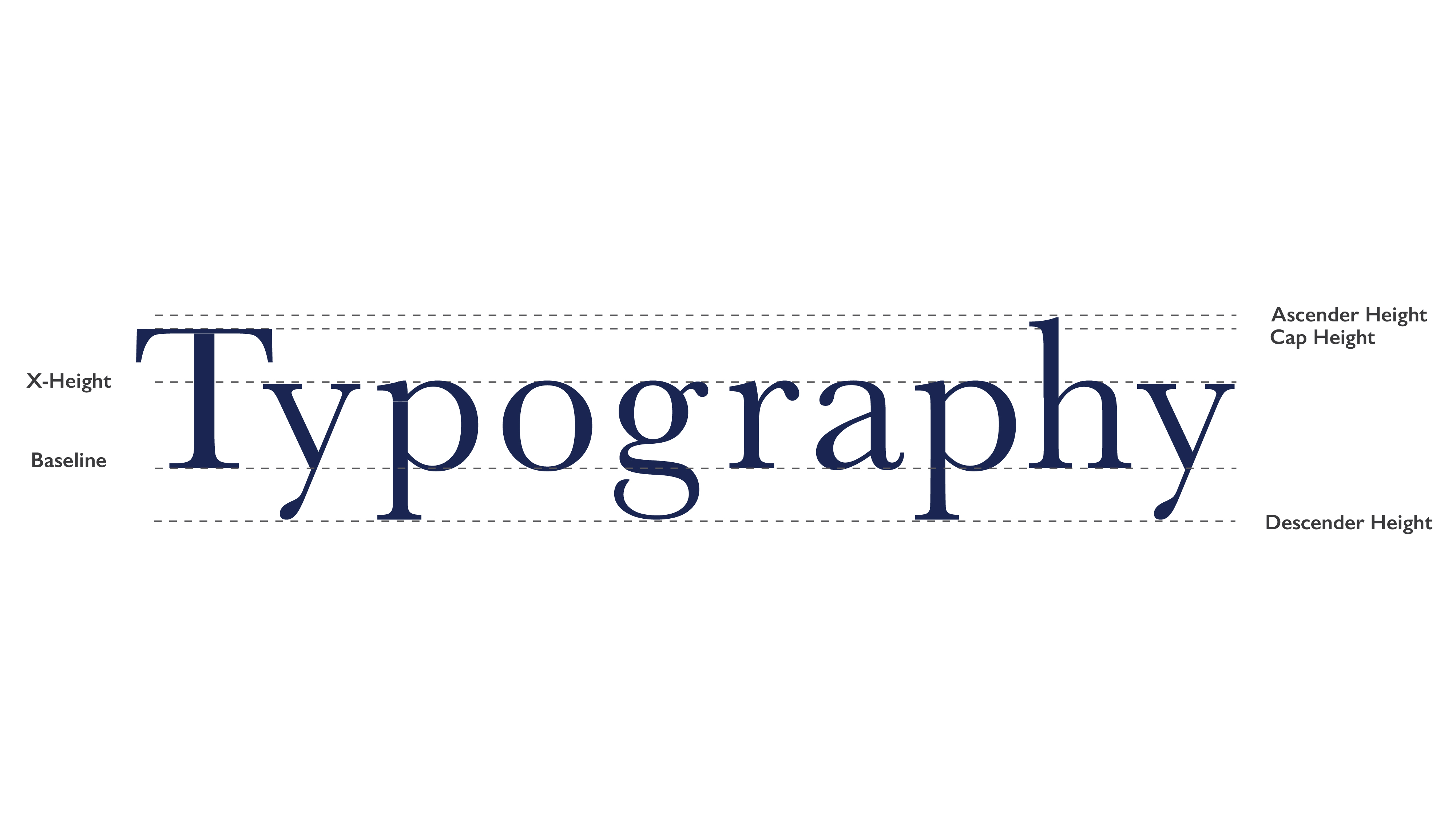
X- Height
The height lowercase letters reach in a typeface. This is always based on the height of lowercase x.
Baseline
The invisible base which all characters sit on. Curves characters like o should sit just slightly over the baseline.
Ascender/Descender Height
The invisible line marking the height of ascenders/descenders in a font.
Cap Height
The height of a capital letter in a typefaces measured from the baseline.
If you enjoyed this post and want to carry on and learn more about how to work with type check out the following tutorials!
UP NEXT
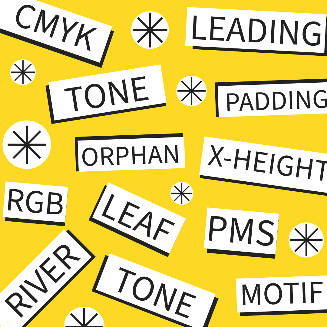
25 Design Terms every designer should know!
Unlock 25 common terms every designer needs to know no matter their skill level. Whether you are designing a brochure in InDesign, editing a photo in Photoshop, or creating a logo using Illustrator, you are sure to come across some of these terms.


