Updated 2024
Using correct color modes for graphic design projects is the key to creating stunning visuals and avoiding print errors! Today we will look at two key color modes and explain how to prepare a document for success.
RGB...
These are the two most popular color systems we work with in Graphic Design and it's essential to know when they should be used. It can save you a lot of time and frustration later down the line!
So if you are ready lets jump in!
What's the deal with CMYK?
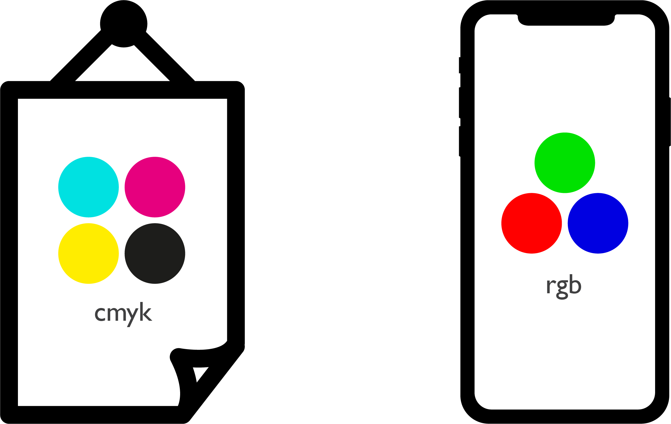
We use the CMYK color breakdown for anything which is going to be printed. Each letter refers to a different color involved in the printing process:
C - Cyan, M - Magenta, Y - Yellow, K - Key Colour (Black)
Black is named as the key color as it is used in the key plate, which is responsible for adding contrast into the final result. These four colors are all mixed together in different percentages to create all the different colours we see in print. This is why CMYK is also referred to as the 'four-colour process.'
What to watch out for...
There can be inconsistencies when printing depending on what printer/ink you are using, the paper you are printing on or even what scale you are printing it.
You should always print a test copy before approving the final. We call this 'a proof' and it can help you avoid having a hundred copies of one design with the same mistake. Something you want to avoid...trust me!
A lot of design software is now set by default to RGB so you need to make sure all your assets are converted when you place them into your files. This goes for images, vectors, type...everything!
What's the deal with RGB?
We use the RGB color breakdown for any work which will be used/displayed on screen, this could be a mobile, computer, tablet, TV etc.
R- Red, G - Green, B - Blue
Instead of being mixed together in a printing process these three primary colors are blended together to create the spectrum of colours we see on screen. The RGB system is also known as an Additive system and relies on the light within screens/electronic devises. All devises have a red, green and blue beam.
What to watch out for...
RGB colors are generally a lot brighter, more saturated and vibrant than CYMK. If you have accidentally created a piece of work you intend to print in RGB colors, chances are it will look a lot duller when you convert it to CMYK. This means you may need to re-jig your design and colour choices a little.
Image Resolution...
Another really important thing to consider when creating any kind of design work is the resolution of the image you are working with.
Having a high resolution image will mean it has a lot more detail because the number of pixels used is much higher. This is great but also means your file sizes will be larger. However if you lower the resolution to much you will have a smaller image but it may become blurry, also known as pixilated.
You should also use a different image resolution for print and screen based work. The terms you need to pay attention to are PPI and DPI.
The term ppi stands for Pixels Per Inch and we pay attention to this for anything we create in an RGB colour profile. Meaning anything which will be used on screen. The term refers to the amount of pixels used per inch within a document. The higher the amount the better quality the image.
Dpi stands for Dots Per Inch this is very important to pay attention to for work created in CMYK that will be printed. The term refers to the amount of the dots of ink per inch within an image. Again the higher the amount the better quality the image.
Printing a low resolution document or image will result in a pixelated low quality final piece. Something you really want to avoid!
A good rule of thumb...
When you're starting a new document in Adobe Illustrator or Photoshop you can set the colour mode and resolution in the New Document window.
When setting up new documents an easy rule to follow is to use:
300 dpi (Dots Per Inch) for any kind of printed work.
72 ppi (Pixels Per Inch) for any kind of web/digital work.
How about InDesign?
If you are creating work in InDesign you should bare in mind that any document you create is capable of using multiple colour spaces at the same time.
This means some of the colours or images could be RGB whilst some are CMYK. This can cause inconsistencies in your work and exported file. Especially if it is a long document.
Check what color space your images are using by heading to the Links Panel.
This will display all the external media you have placed into your InDesign File.
When you select a link InDesign will show you all the information it has about that asset.
You can find out loads of handy info including the Effective ppi. This is handy to know if you have resized the image at all.
If you make images larger or smaller the resolution of those images within that document will change.
So just keep an eye on your Effective ppi to!
To sum it up!
Thanks for reading guys!
Hopefully you found this useful, if you interested in learning more on color, you may enjoy these tutorials!


