In this blog post, we share 7 Typography rules you should follow in Graphic Design, especially if you are working on Editorial projects using Adobe InDesign!
Watch our tutorial below to get a full understanding of Type Rules you should follow!
1.Define clear entry points
In Editorial design, Entry points on your spreads play a crucial role in attracting readers to your layout.
Entry Points helps readers to keep engaged and prompts one to read the article. Entry Points can include Drop Caps, Headings, Titles, Pull quotes or Graphic elements that direct readers to the text. However, use Entry points moderately.
See below examples of two layouts, one with and without Entry Points! The one with the Entry points included stands out instantly and draws more attention to the spread.
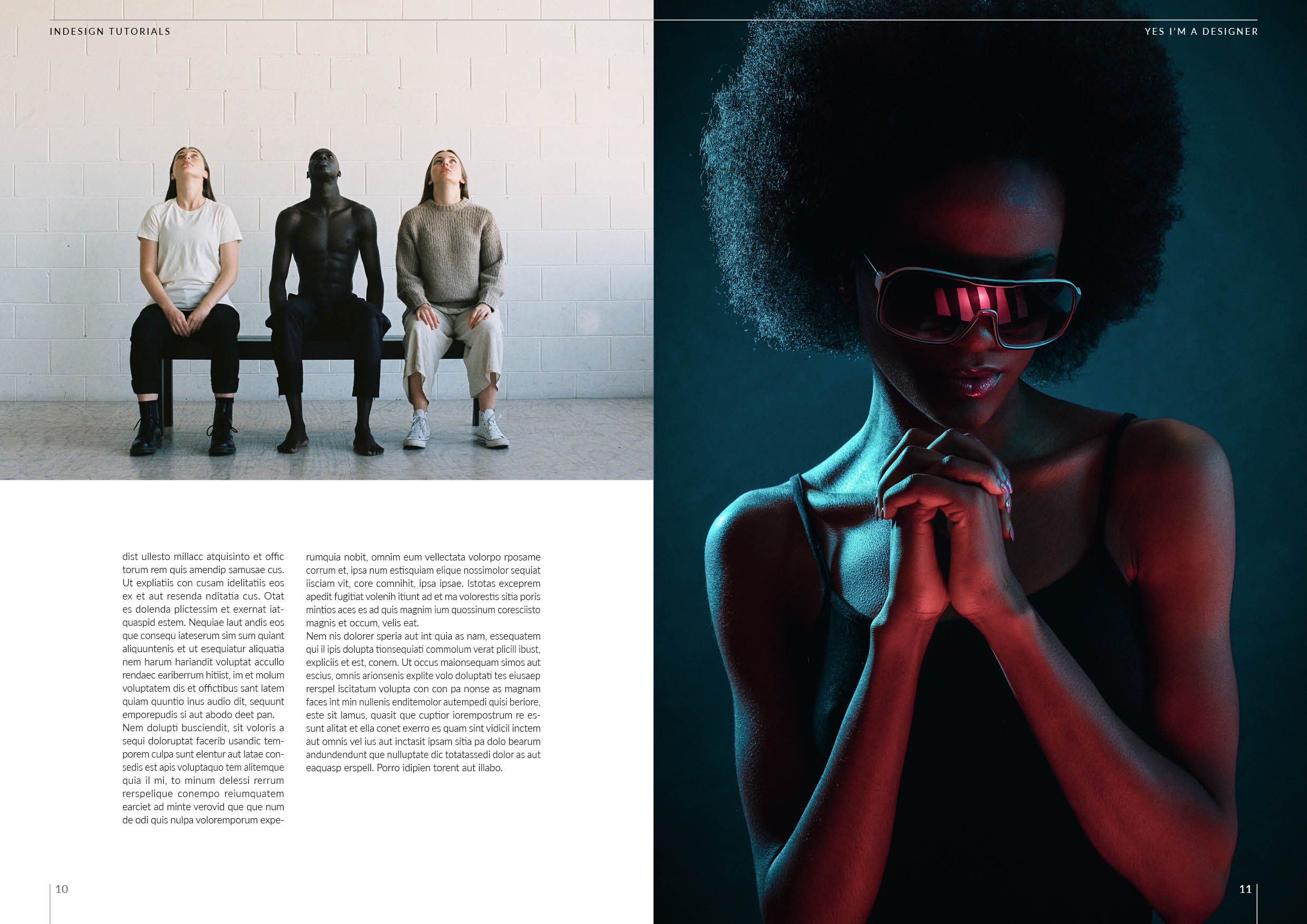
Without Entry Points
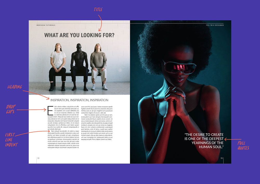
Entry Points included
Want to learn more on Entry Points? Check out our tutorial below, We will focus on designing eye-catching drop caps in Adobe InDesign and Photoshop!
2.Line length (measure)
To improve the readability of your text, you should always measure your line length. Ideally, each of your lines should be between 45 to 90 Characters, and that includes spaces as well.
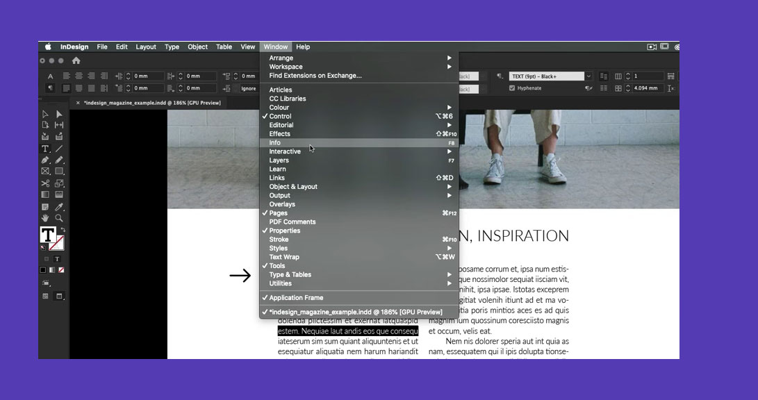
To get the actual reading of the line length simple, triple-click on the text, this selects the single line and then from the Window menu, select the Info Panel.
So why is line length crucial? Having long text (above 90 Characters) becomes very uncomfortable to read since you have to jump a very long distance to the next line, this becomes more difficult to read, especially for short-sighted and dyslexic readers. In contrast, having text is to narrow is also hard to read, since readers will need to jump quickly from line to line
3. Alignment carefully
Alignment is fundamental in good typography; in general, align left is the most common way of setting type as readers tend to read from left to right. (However, note that there are some cultural differences, for instance, in Arabic writing, readers read from right to left.)
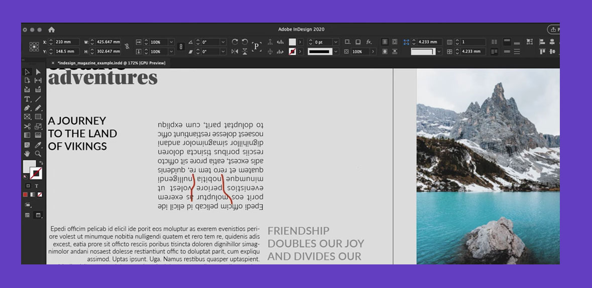
If you also use Justification in your body copy, you need to try to avoid Rivers, now what do you mean by Rivers? Rivers are gaps between the text, and the best way to avoid Rivers appearing in your text is to use Justification on Line Length higher than 60 Characters and allow Hyphenation.
4. Apply Visual space on Block of Text
When you work with a Block of Text, you should consider making the reading experience enjoyable. Firstly you can do this by making sure your typography creates a visual break between each Paragraph.
You can do this is by applying first line Indent (but do not include it on the 1st Paragraph). Another way to add Paragraph space is by using apply the space between features, which automatically creates a visual break with even space between each Paragraph.
5. Pairing fonts wisely
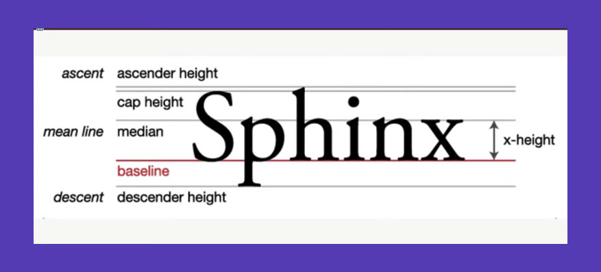
Pairing Fonts that work well together is crucial for good typography. One rule to follow is to keep X-height the same or similar between the two fonts, so when fairing fonts, try to add contrast, but it's important to align their
X-height.
6. Hanging Punctuation
When using Hypernation on your body copy, it is always best to select the Optical Marginal Alignment, which keeps the Hyphenation outside the text frame.
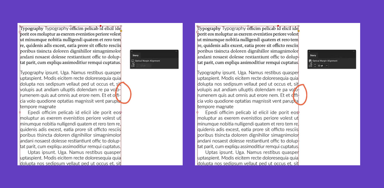
Without Optical Marginal Alignment

With Optical Marginal Alignment
7. All Caps
Finally, using ALL CAPS is a big no when it comes to editorial design. Although it can work well on Titles, Heading, or even Pull quotes, it's best to avoid all caps on the body copy as it can make reading feel very uncomfortable and feel like you are shouting at them.
I hope you enjoyed our 7 Typography rules, be sure to watch our full tutorial to get in-depth knowledge on Typesetting and rules to follow:
UP NEXT
Learn to work with Typography and create outstanding visuals that will turn you into a Photoshop Pro
LEARN ADOBE APPLICATIONS
from Adobe Certified Instructors and industry professionals


