There are 41 panels in Adobe Illustrator and you know which one does not get enough credit? The Appearance Panel.
Many creatives don't have it open whilst they work and although it's not as essential as say the Pen Tool there's definitely some great reasons to take it more seriously!
Watch the full tutorial above to see Martin demonstrate the techniques or if you prefer read on.
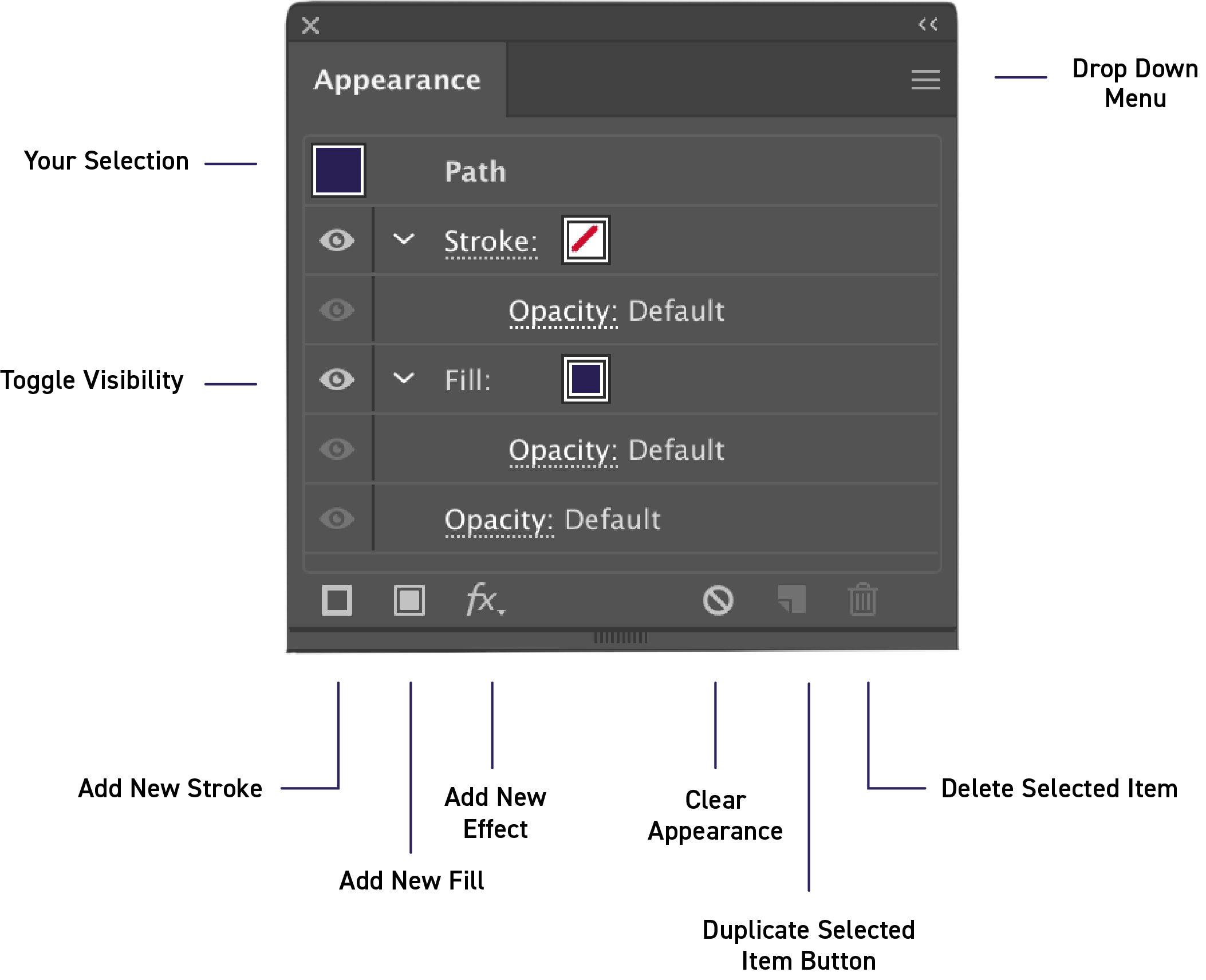
Panel Overview
Open the Appearance panel by
going to Window > Appearance.
This Panel allows you to view and adjust the appearance attributes for an object, group, or layer.
When you apply multiple effects to a piece of work they are listed from top to bottom in the order which they are applied.
You can add new Fill Colors, Stroke Colors and Effects.
Align Stroke Technique
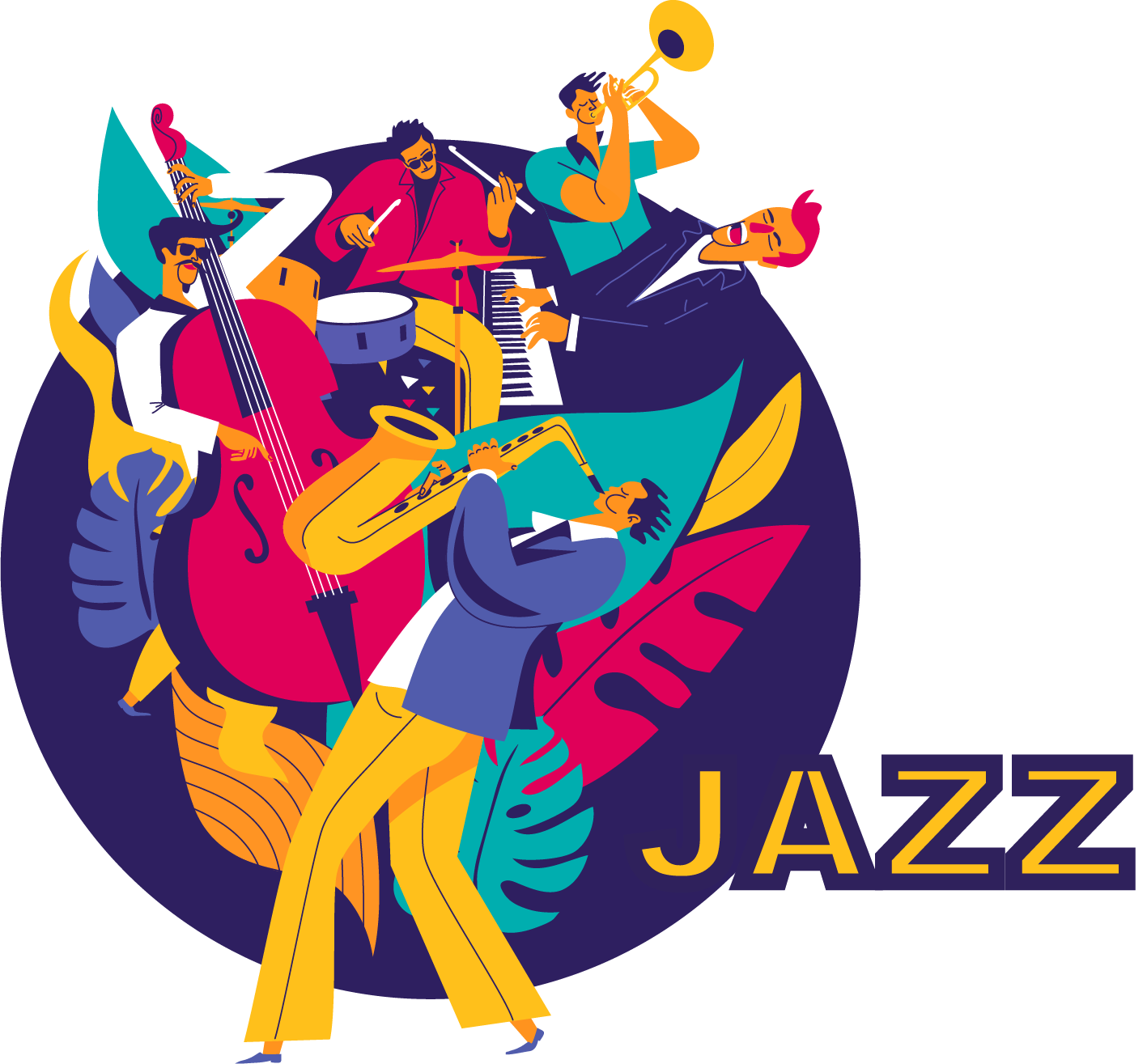
When you are working with editable text it's hard to apply and use a stroke on the letters because the stroke overlaps the character making it appear much less visible.
This can be frustrating if you don't want to outline your text but you need it to really stand out in a design with lot of other elements!
Here's how to set up this technique:
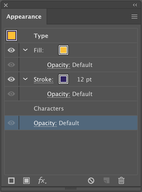
Go to Window and then to Appearance to open the panel. You need to add a Fill and Stroke here. Then set up your color.
Once you have picked pull the stroke attribute down so it is below the fill attribute. Just like in the example to the left.
Now when you look at the text the stroke appears behind the fill color so less of it is visible. See the example above.
You can then adjust the thickness of the line so you can see more or less of it from behind the fill color.
For a full walk through and loads more tips on this technique check out the tutorial!
When working with the Appearance Panel remember you can rearrange the stacking of any attribute you add by dragging it up or down in the Panel.
Top to bottom in the Panel correlates to front to back in the artwork. That's why when you place a stroke attribute behind a fill attribute it hides part of the stroke line.
Illustrating with the Appearance Panel
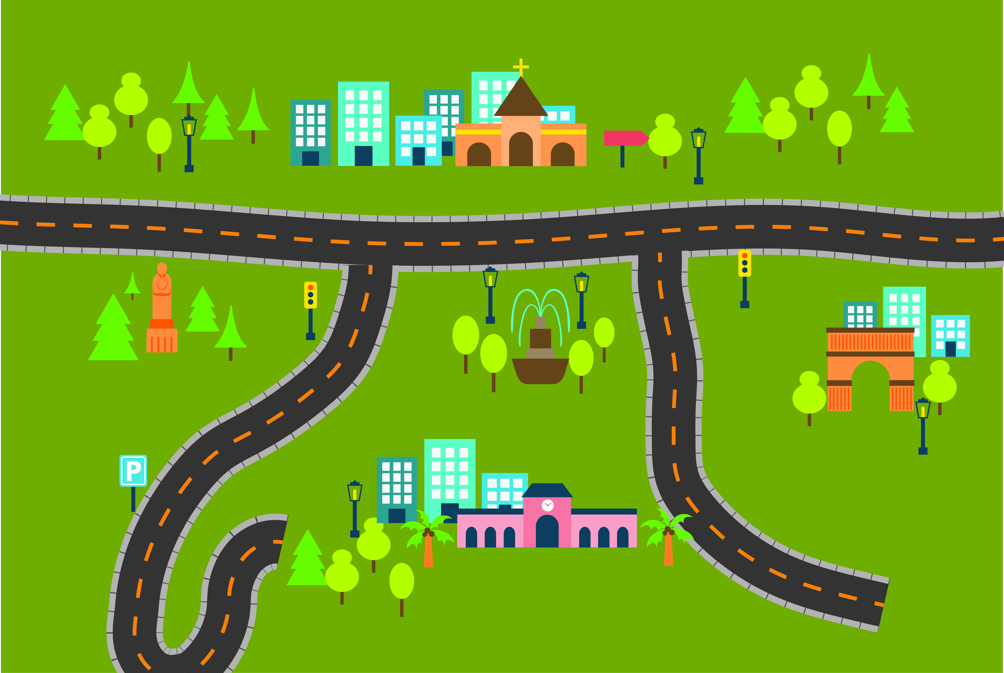
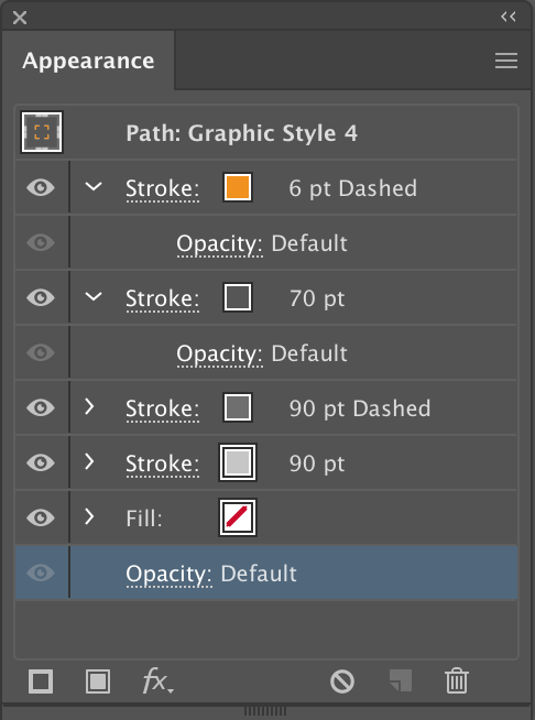
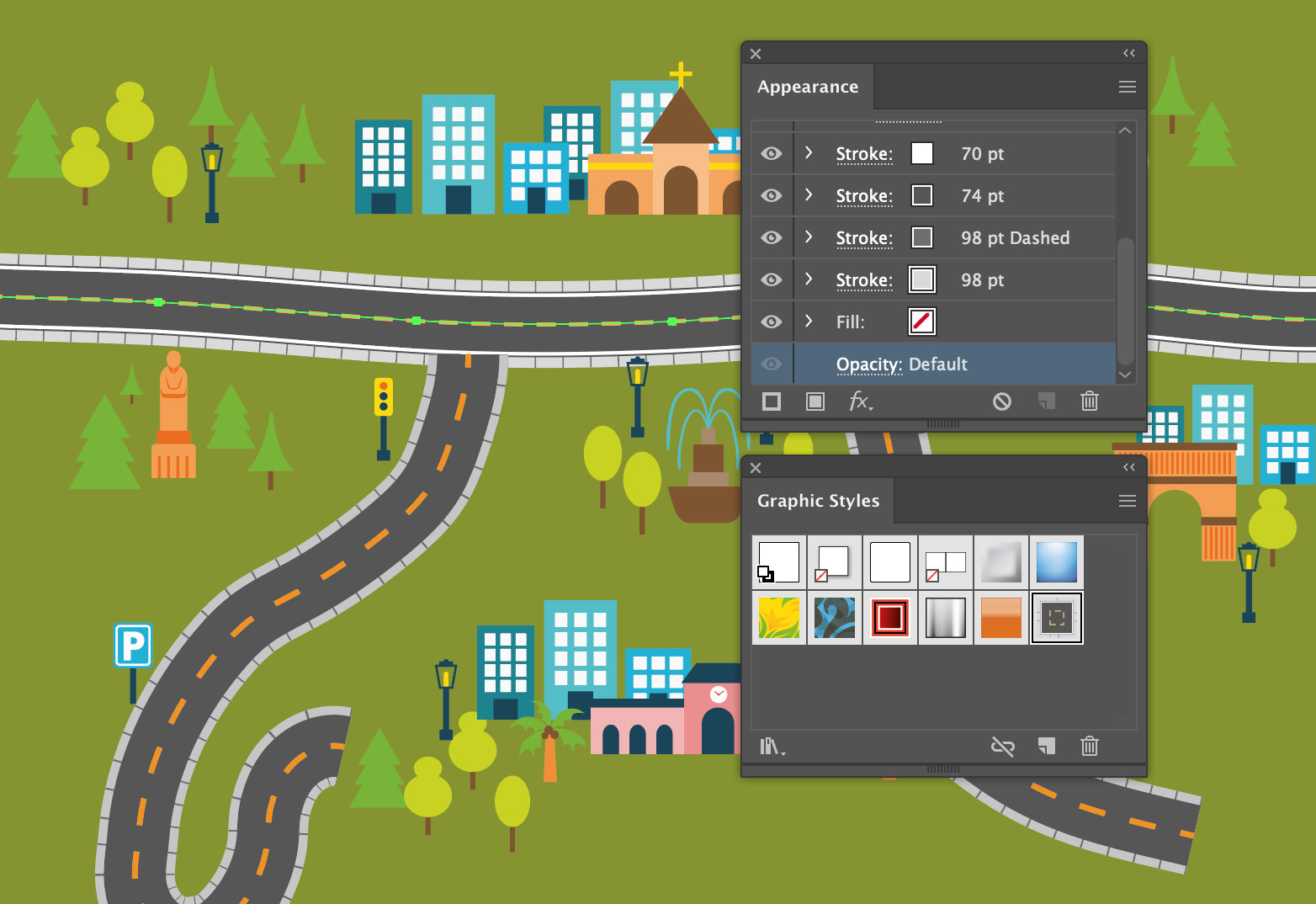
- The dashed line is the the top most stroke. This is used to mark the middle of the road and is set to 6pt.
- The middle stroke aka the road is dark grey and set to 90pt.
- The lower most stroke is light grey and set to 70pt. This acts as the pavement.
Think of it kind of like the layers panel where you build up layers of your work to make a whole. You can even add more detail by adding further attributes.
Check out the full tutorial for a step by step guide to recreating this effect.
The road in this Illustration is actually made up entirely of Strokes in the Appearance Panel!
You only need to use 3 Strokes to set up this technique and create a road you can draw and extend. Let's take a closer look...
Plus find out how you can add even more detail simply using Strokes in the Appearance Panel!
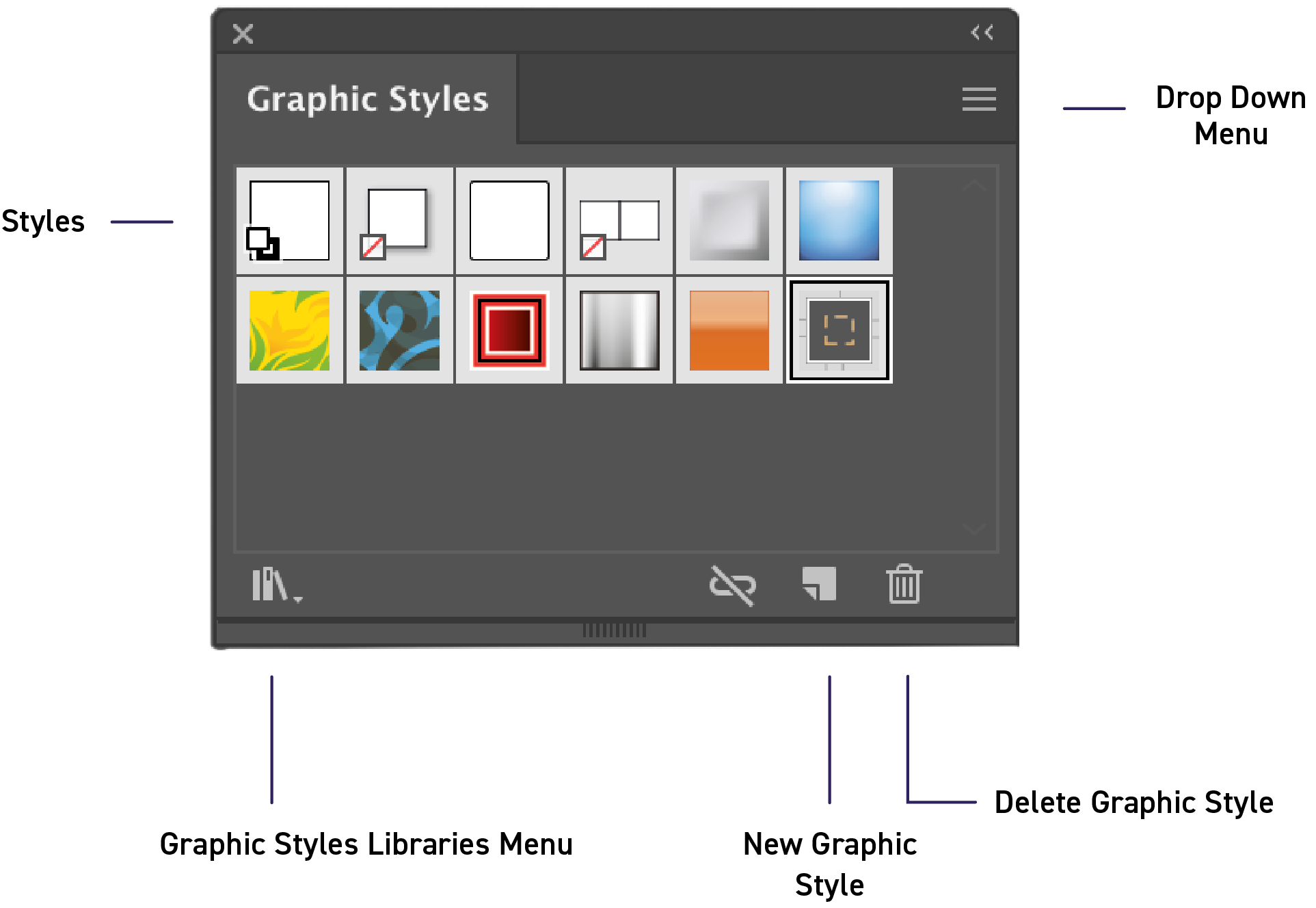
Create a Graphic Style
A Graphic Style is a set of reusable appearance attributes. If you really like a style you create using the Appearance Panel you can save it as a Graphic Style and use it on other objects, groups or even layers.
Let's talk more about how to do this:
We have loads more handy techniques we want to share with you. If you would like to know more about the Appearance Panel watch the full video tutorial.
Thanks for reading and let us know what you what you think in the comments below! If you want to carry on reading why not check out another cool Illustrator technique here.

