We recently teamed up with 99designs to review the entries for a recent contest ran via their platform. The challenge? Design a technology-based festival logo design. Sounds fun right?
Read on to see a wide selection of logo designs from the whopping 409 entries?
The aim of this collaboration was to help you learn about Graphic Design and Illustration by looking all kinds of submissions, from the winning entries and finalists to the less successful logos.
Watch the full tutorial for a walk-through of the brief and to see loads of the entries. Martin talks about why some of the logos were not suitable for this brief and why some stood out!
The Brief
Below are some of the brief requirements set by the client. If you fancy taking a look it will help you understand why some of the designs below were less successful. However, if you want to jump straight in and see the work just keep scrolling!
Main objective: Illustrate a festival logo in fun, playful style.
Design Inspiration from client:
Background Information:
Include the events name: Levels
Include this slogan: Melbourne 2018
Industry: Technology
Background information: 'We're a festival! The festival is a one day event that is high energy, fun, interactive, and full of knowledge. Our attendees for the festival come from various backgrounds, some are university graduates, some have taught themselves, and some have attended training. This event is about computer programming and coding, think computers, internet, etc.'
Additional instructions from client:
- Fun, playful and illustrated.
- The theme is Levels, so think of stairs, direction, dimensions.
- Incorporate computers, nodes, wires, keys, code syntax.
- No plain text logos or wordmarks.
- The logo should work well as a sticker on a laptop.
- Ultraviolet Pantone colour of 2018 to be used in the design.
- Provide mockup both on white and dark backgrounds.
The Submissions
Below you can take a look a range of designs submitted to this competition. We have included examples which didn't hit the mark this time and some which were close to winning!
Remember when you approach any project the most important thing to do is read and consider the brief. You could create a beautiful piece of work but if you don't follow the clients instructions it wont be approved or in this case win!
Watch the full tutorial to see loads more entries to the competition.
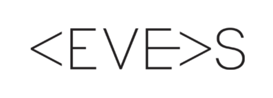
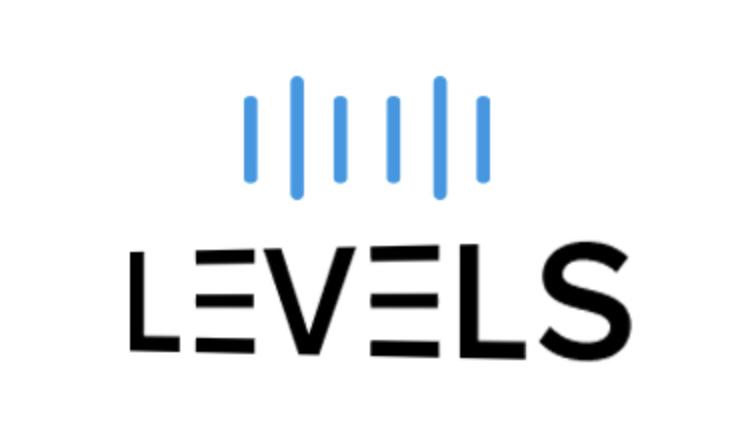
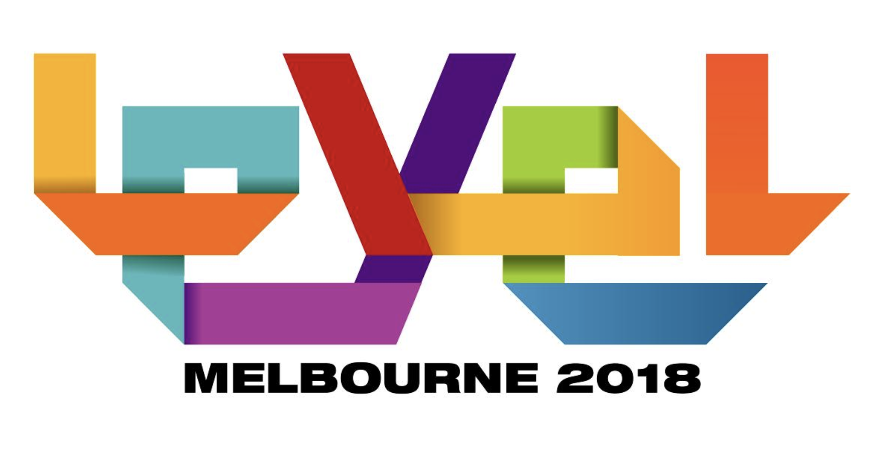
Here the logos do start to play on the idea of levels and simple imagery related to tech but are very clean and corporate.
These attributes do not fit the brief or follow the style of examples provided. Remember it is not as simple as a design being really good or really bad it's more about following the guidance of the client. These designs were rejected on the basis that they didn't include any playful elements!
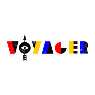
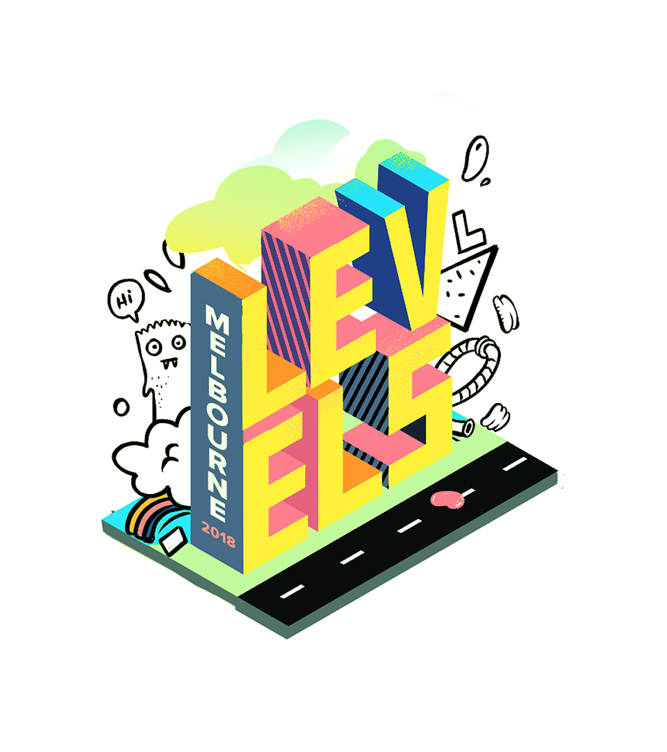
Here, the logos play too much on the idea of being 'playful' although the client wanted a fun final result with personality they also mentioned many other attributes the logo should include.
It's important to have balance within a logo and make sure it fits all the requirements in a brief not just one or two. Clients can be fussy enough, don't make it too easy for them!
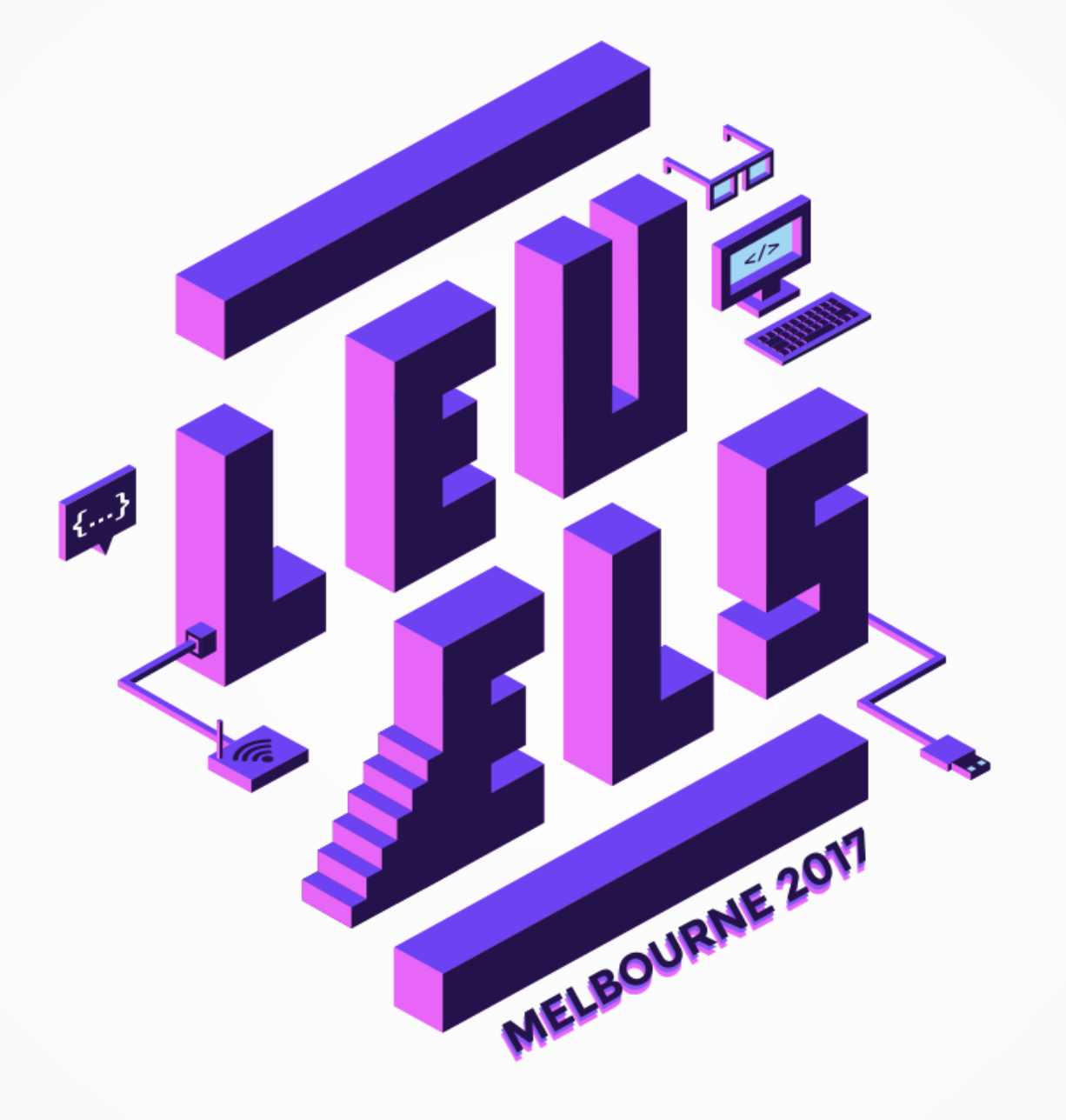
Here we are getting really close, the designers have clearly kept the brief requirements in mind while producing this work. Both logos are playful, use imagery relating to tech, use color well, play on the idea of levels using isometric design and fit into contemporary design.
They were close to being winners but could do with some more finessing. The logo on the left feels like it uses a little to much space apart and appears bulky. Meanwhile the design on the left it's very condensed with a lot of design elements and colors. Perhaps a few could be removed? What do you guys think?
The Winning Design
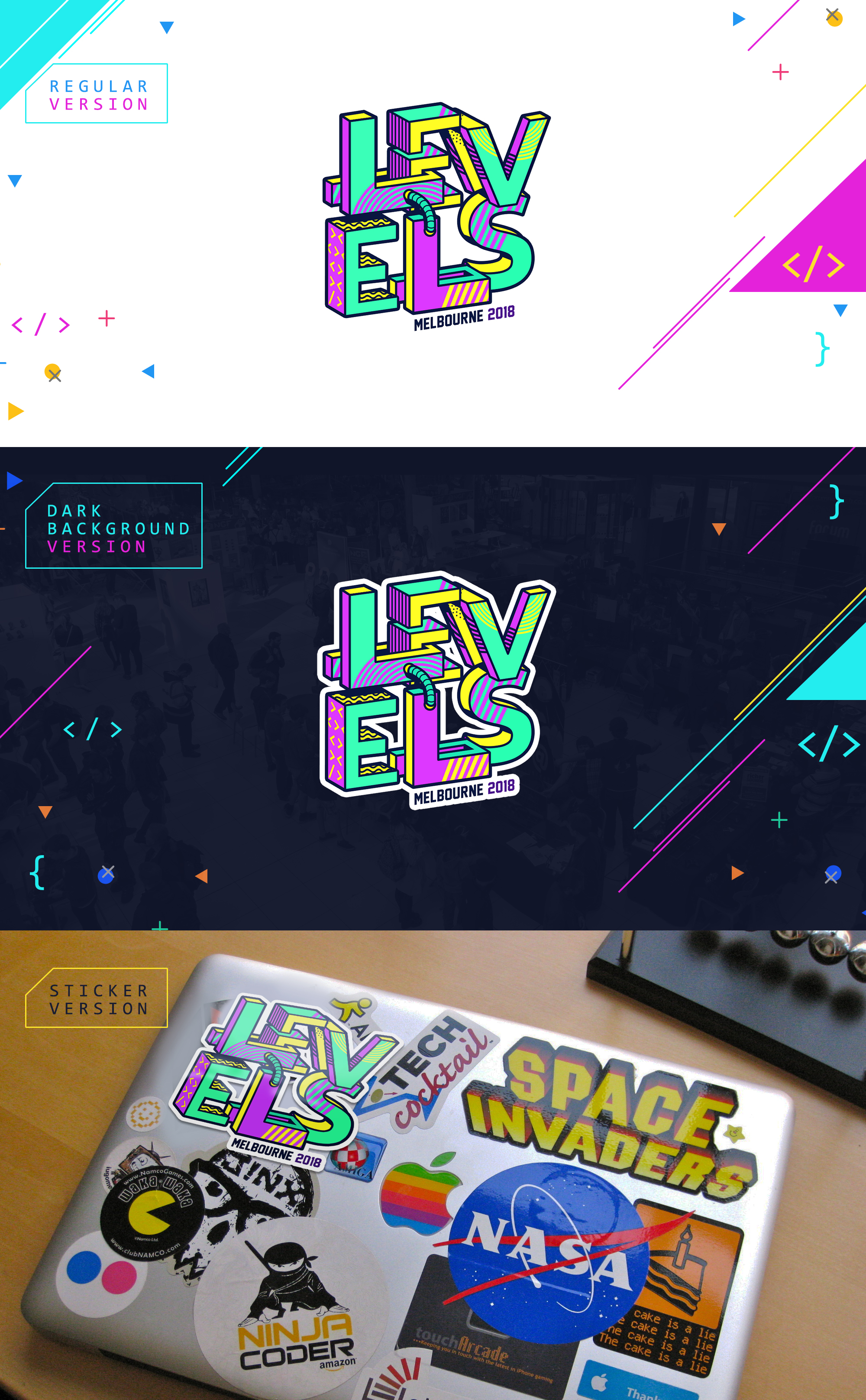
The designer who won this competition, Asael Varas actually submitted 15 versions of the design. Each with slightly different patterns, colors and compositions.
He clearly read and paid attention to all the requirements for the brief this is where a few other designers fell short. It's important not to place too much importance on one design requirement i.e 'playful' but to ensure you pay attention to the whole brief and every requirement set by the client!
That's the key to winning design contests and generally creating good design outcomes.
We love this design and 100% believe it deserved first place in this design contest! We would love to hear what you thought. Let us know in the comments below!
Or take a look at the full tutorial over on YouTube and use the comments section below the video.
Feeling inspired to take on your a design contest? Follow this link to get started! Or if you want to carry on reading we think you will enjoy this blog post!
LEARN ADOBE APPLICATIONS
from Adobe Certified Instructors and industry professionals

