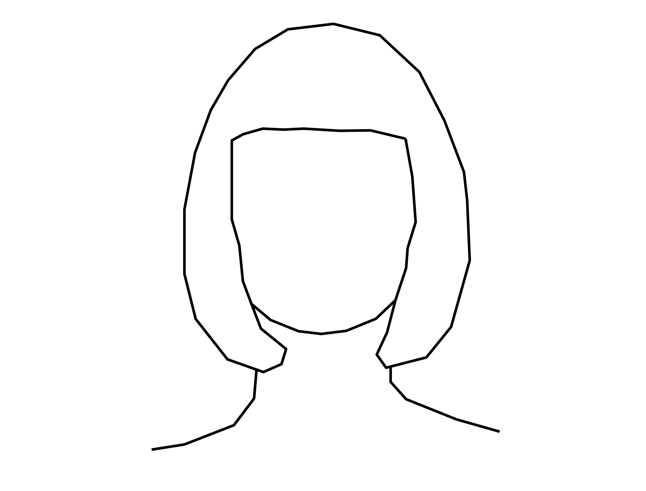
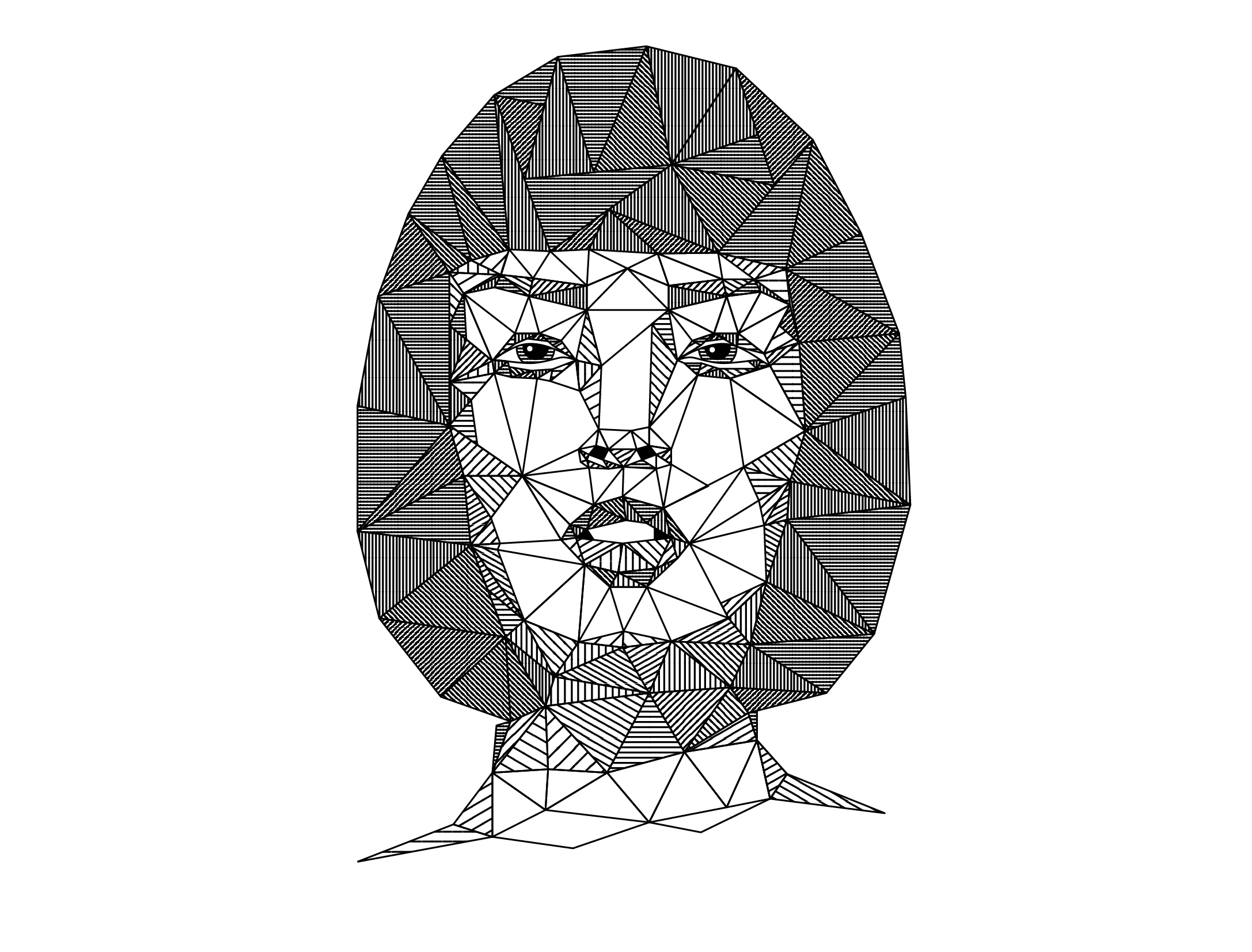
You might have heard of Low-poly style illustrations. There used to be a massive trends towards this style and we think it has a lot of potential. So our team did plenty of research and thought of a way to bring low-poly up-to date.
Sometimes combining different styles and techniques can help you to come up with something new that both fits into current trends but is also unique to you!
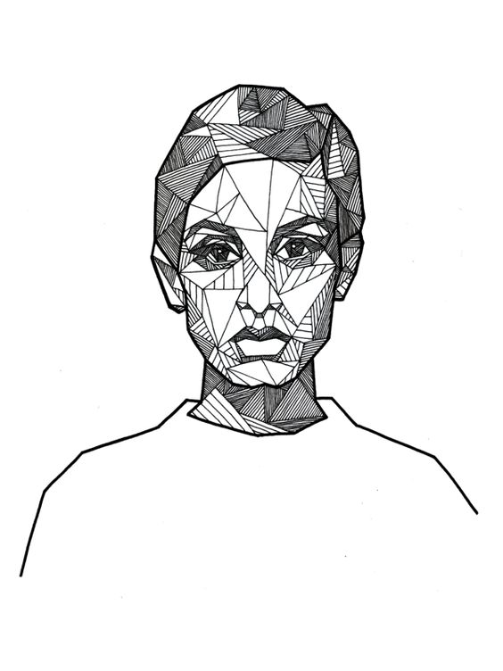
In this tutorial Martin will show you all the techniques you need to create an illustration like the one you can see above. When working on compositions like this it's good to spend a little time working out a technique that is both precise and not to time consuming.
Learn about:
- Creating crosshatch pattern swatches.
- How to draw polygons and work with the Path Average and Join features.
- How to create pattern variations with the Transform panel settings.
- Using Opacity Masks to add some colour!
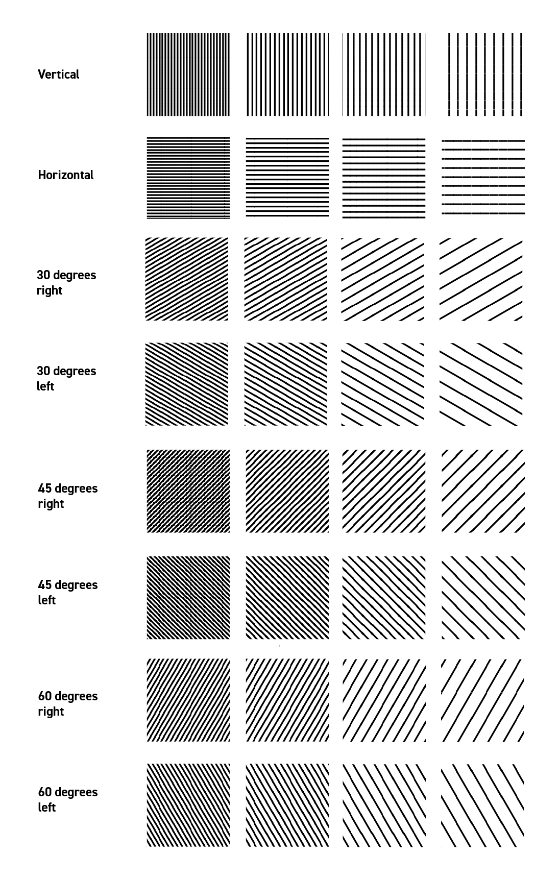
Here you can see how many variations of the crosshatch pattern Martin created to be able to work on this illustration. The method to create each of these patterns is actually pretty much the same. If you fancy learning how to make them yourself find out in the tutorial above!
The great thing about creating swatches is that they are easy to apply to different shapes, easy to replace or remove and they are always editable if you change your mind about a design later in the process!
Read on to discover the inspiration behind this tutorial and style of illustration.
Reference Images
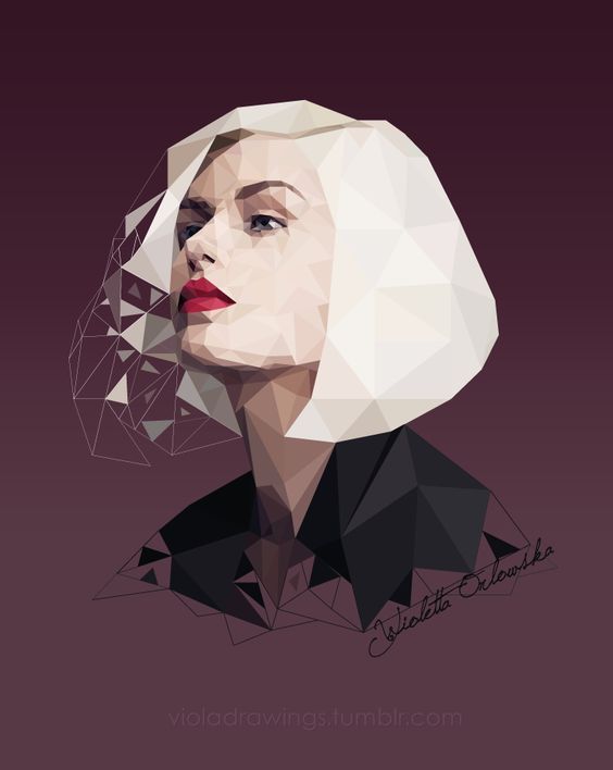
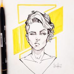
We created a Pin board where the team attached art-work we found interesting and inspirational. This acted as the starting point for developing a style Martin could work with.
Here's some of the key images which influenced the final design!
The final outcome
Final Outcome (without colour gradient.)
Towards the end of the tutorial you can see a time lapse of Martin working on the illustration in Adobe Illustrator which took him around 2 hours to complete. You can see how he experiments with different swatches and takes time to consider the balance of shapes within the outline you see above! It's important to remember that id something feels unbalanced or doesn't look quite right you just need to go back and work into the design more. It doesn't mean it's bad or the final outcome will not work just that it needs some refinement.
Thanks for reading! Hopefully you found this post useful and inspiring. Let us know what you think in the comments below!
Want to master design trends?
We think you will enjoy our online courses!

