
Before starting using Photoshop we need to have a basic understanding of how digital images work. There are some important terms and concepts, which will help us to enhance and adjust our images correctly and to make professional decisions with our Photoshop projects.
We are going to use several devices when we work with digital images like digital cameras, scanners, monitors, printers etc and we need to know how to use them properly.
Parts of this series:
1. Digital Image Theory
2. Working with Bridge
3. User Interface
4. Making Selections
5. Tonal and Colour Adjustments
6. Working with Layers
7. Retouching Images
Pixel vs vector graphic
There are two kind of digital images: vector and pixel images. Pixels are used for photographic images, while vectors are better for illustrations, text and shapes.
Pixels are small building blocks like mosaics. Each pixel can show only one colour, but from a distance lots of pixels together can create the illusion of a smooth, photographic picture. Pixel images are resolution-dependant, but it is easy to manipulate them and use photographic effects on them. Photoshop is mainly a pixel-based graphic application.
Vectors are created with curves and anchor points and they have the advantage of creating resolution-independant images. Photoshop has some vector tools like the Pen tool, the Type tool or the Shape tools but mainly Adobe Illustrator is used to create vector images.
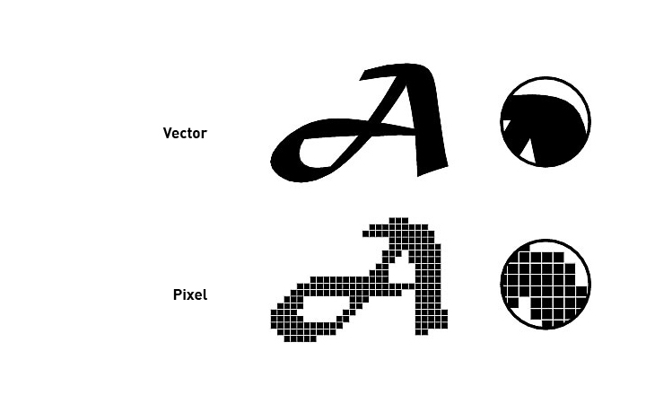
Image size and resolution
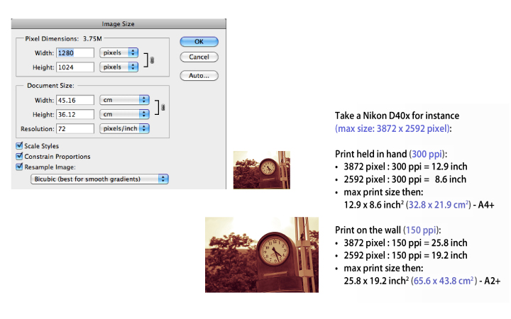
Pixel images are resolution-dependant, which means you have a limited print size with them. To be able to make a high quality print you need to use 300 ppi (pixel/inch). It means that the printer will print 300 pixels of the image on an inch length on the paper.
The closer you put the pixels to each other the better the quality but the smaller the print size will be. 72 ppi is the standard for viewing images only on the screen, but it is not enough to achieve high quality commercial print. If you print an image in 72 ppi resolution it will look pixelated on the paper. Pixel graphics are also called raster or bitmap graphics.
Resampling an image only increases the number of pixels in it but does not improve the original quality of it. If you want to change the resolution without affecting the pixel dimensions make sure that you uncheck the Resample Image option in the Image Size dialog box before changing the values.
You should use Bicubic Smoother for enlarging images and Bicubic Sharper for reducing their sizes.
Colour modes and colour management
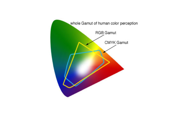
Every device that uses light work in RGB mode (TV, monitor, projector, scanner, digital cameras etc.). The three channels red, green and blue are used to represent the colours and every channel can store 8 bit information (256 colour values for each channel). The standard RGB image has 24 bit depth for the whole image, which gives us 16,7 million colours. The most intense colour in RGB mode is white.
When you need to print a digital image you are going to use CMYK colour mode, where you need to build your colours with cyan, magenta, yellow and black inks (key colour). The most intense colour in CMYK mode is black.
To simulate CMYK colours or other special colours we need to use soft proofing. This technique tries to show on screen the colours that we will see on the paper. To be able to simulate a printer’s colour you will need to get or create an ICC colour profile and load it for Photoshop’s Proof View as a custom profile.
It is a good idea to calibrate your monitor if you work with digital images a lot (the best is to get a graphic monitor and calibrate it regularly).
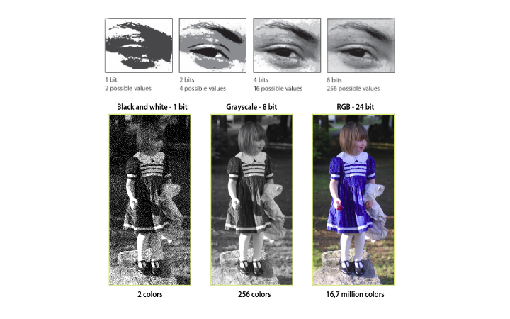
Bit depth
Bit depth sets the number of possible colours that you can use in an image. If you have 1 bit depth you will be able to use only two colours (usually black and white), but if you have 8 bit depth then you will be able to use 256 colours. Technically an 8 bit image is referred to Grayscale image where you see black and white and 254 other grey values together in the image, but you can also use the 8 bit to store colour information (for instance GIF images).
A standard RGB image has originally 8 bit depth of information stored on every channel. This is far less than the human eye can perceive but this is the standard colour gamut for digital images.
There is a larger bit depth file format, the RAW image format, which gives you a larger colour gamut. You can capture much more colour information with RAW than with normal 24 bit RGB images. The basic RAW definition can store up to 12 bit (4096 colours) per channel, which means 36 bits/image. It means that you can capture much more colour information in the difficult areas (shadows and highlights), which makes it much easier to work with the image (change the exposure, tonal values and colours).
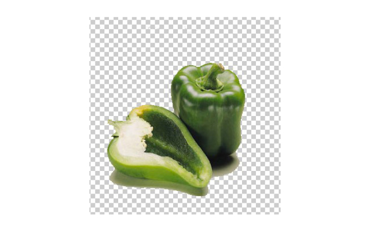
Transparency
Some image formats can store transparency information together with colour information. This information is also stored in a channel like colours (RGB) but it is called alpha channel. You can save completely transparent parts in an image or semi-transparent parts.
You cannot save transparency in JPEG images but you can do it with several other image formats like PNG, TIFF, PSD, PDF, GIF etc.. If you need only one layer in your image you should use PNG or GIF. PNG is better for photographic images, GIF is better for illustrations. If you need to save more layers and transparency as well you should use PSD or TIFF file formats.
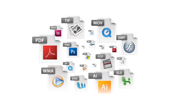
File types
Most of the time we work with image files in Photoshop, but in some cases we import 3D models or even video files into our documents. Photoshop can open most of the common image formats but some of its features are only available with particular formats.
The work file that can save layers and transparency is the PSD format. It is recommended to always save and keep the PSD file for it is the only way to easily change our work later on.
The only disadvantage of PSD files is the large file size. A TIFF file can also save all layer and transparency information but it can use several compression types. It is better to use lossless compression (LZW or ZIP), but if you need to minimize your file size you can even use lossy JPEG compression with a TIFF file.
To get the smallest file size while maintaining the image quality JPEG format is the best option. You should use the File / Save for Web and Devices option to compare different compression options and find the best setting.
Compression and noise
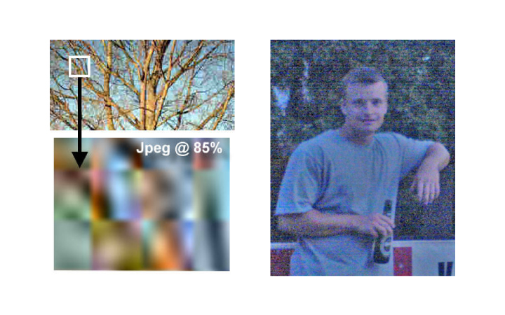
Both compression and bad exposure can make noisy images. Mainly using compression results in pixelated, blurry images, while bad exposure can result in colour noise.
The more compression you use the smaller the file size will get but the worse your final image quality will be. With JPEG images the best quality is 12 and that is nearly lossless compression, but make sure you do not save a JPEG image over and over again, because that will slowly but surely ruin the quality of the image. If you use 6 for JPEG compression or more you will see a considerable change in the file size but still maintaining a fairly good quality.
Colour noise mainly appears in under-exposed images when you try to increase their brightness. It is hard to get rid of the noise once you have it without losing the sharpness of the image. It is always better to find a properly exposed photograph to start working with. The best way to find out whether a photograph is properly exposed is to check its histogram (we discuss reading histograms on the next page).
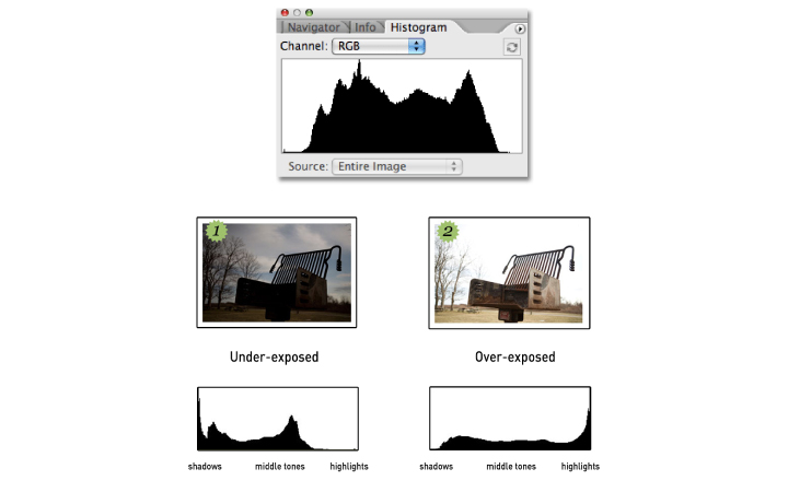
Histogram and tonal range
Every digital image has a tonal range, which is best represented by the histogram. A histogram shows the amount of the tonal values in an image. On the left you see the shadows, in the middle the middle tones and on the right the highlights. The peaks in the histogram indicates the amount of values. The higher a peak is the more tonal values you have in the image in that particular range. For example the histogram on the right is an average tonal range image where you have fair amount of shadows, middle tones and highlights. The more peaks you see in a histogram the easier to adjust and work with the image, because that is when you have the most colour and tonal information captured.
You can increase the contrast of the image if you use Levels adjustment to clip the empty right a left sides of your histogram. You can use Shadows and Highlights adjustment to improve the quality of a high contrast image by selectively change the two extreme tonal areas.
The worst is if you see high peaks attached to the left or the right edge of your histogram. That means you have an severely over-exposed or under-exposed image.
Nondestructive workflow
It is very important to know how to work with Photoshop completely nondestructively to be really effectively and to be able to make changes to your work easily later on.
There are some key concepts to achieve a nondestructive workflow:
1. you need to use layers to organize and handle parts of your work separately (and do not merge them but keep them whenever you can)
2. use adjustment layers instead of using direct adjustments on image layers
3. make layer masks from your selections
4. use smart objects and smart filters
We will discuss these concepts separately later.
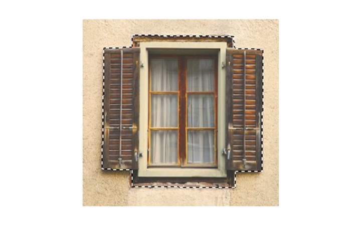
Working with selections
Nearly every time you would like to change something on an image you will find yourself making a selection. With selections we can target particular parts of our images and make adjustments only on the selected parts. It is very important to understand how selections work and to learn several ways to make them.
The best way to think is to always start with a quick and rough selection and then refine it more and more until you have what you wanted to select.
There are tools for rough and quick selections like the marquee tools, the magic wand and the very useful quick selection tool and there are more sophisticated tools like the pen tool, extract filter, colour range etc.. that you can use for selections but they will take more time.
It is always a good idea to combine selection tools and techniques during making a selection and get all the advantages of different tools while perfecting the selection.
Working with paths
Paths are vector curves and they are the most difficult or unusual way to draw lines for users new to Photoshop. It is very important though to get accustomed to using them for they are really useful in many ways.
The construction points of the curves are called anchor points. An anchor point can both connect straight and curved path segments. You can build paths with the pen tool by defining the position of anchor points. By just clicking with the pen tool you will make straight path segments.
To make curved segments you need to click and drag with the pen tool. This way you are going to create direction lines, which will define the curves of the surrounding path segments.
By Alt clicking and dragging on anchor points you can convert the surrounding segments from curved lines to straight lines and vice versa. By Ctrl/Cmd clicking and dragging anchor points you can move the points around.
Depth of field
Depth of field is a common phenomenon is photographic images. It appears in an image usually when the subject of the photograph is close to the lens.
The area within the depth of field appears sharp, whilst the areas in front and beyond the depth of field appear blurry. This blurriness can enhance the three dimensional feel of the objects in the photograph.
Deep focus means you see everything sharp while shallow focus means that you see only a short distance in focus.
Making selections and changes in an image is more difficult when there is a shallow focus in the photograph. With blur filters depth of field can be added and simulated on deep focus images.
You have to work selectively on shallow focus images. For instance when sharpening an image you need to make sure that you do not try to sharpen the blurred out background area.

To be continued soon…
Please don’t forget to comment
and follow the page on Facebook and on Twitter!
