Serifs are back and in a big way! They are no longer considered dated and out of style in comparison to the more modern San Serif
'San' means without in French so the phrase Sans-serif literally translates to without serif.
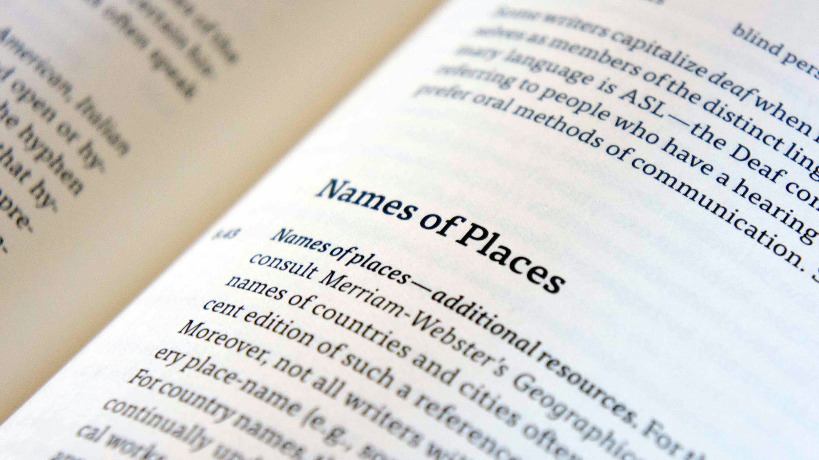
The modern Serif is packed full of personality, no longer held back by their elaborate flourishes. Now we love using Slab Serifs and typefaces with a high contrast in their characters/letters.
I have been reading a lot about what typography trends we will see dominate the design world in 2019. As well as looking at creative projects from agencies and freelancers to get an idea of how everyone is using type.
Below is a list of Serif typefaces/styles I think we will see a lot of in 2019.
Remember these typefaces will give you an idea of the styles and shapes which are trending. If you fancy finding your own choices try Adobe Fonts. There's loads of contemporary styles! Plus if you have a Creative Cloud membership the licenses are all included. Which means they are ready to be used without any extra cost!
1. Cooper BT
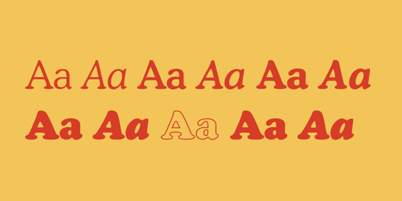
Most of us have heard of Cooper Black. It was originally designed by Oswald Cooper and commissioned by Barnhart Brothers & Spindler foundry in 1922. I have seen Cooper Black cropping up all over the place recently. Especially in branding and poster designs, even on Netflix originals!
It has now been expanded into a full font family by Bitstream. I think this means we will see even more of it this year! These extra weights and styles make Cooper a more appealing choice to use in design projects. Having more options means you can mix up styles and introduce contrast into your work.
Cooper Black is available on Adobe Fonts, the rest of the family can be purchased for £25 per weight.
2. FF Tisa
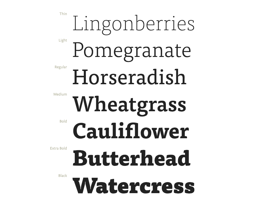
This is a great all round choice of font. The lighter weights could easily be used for chunks of text/copy. Or on websites and editorial projects etc.
The heavier versions of this font would look great used as logo typefaces or on poster designs as titles.
Choosing a typeface with a large family is always a good idea. It provides you with plenty of flexibility and choice whilst designing.
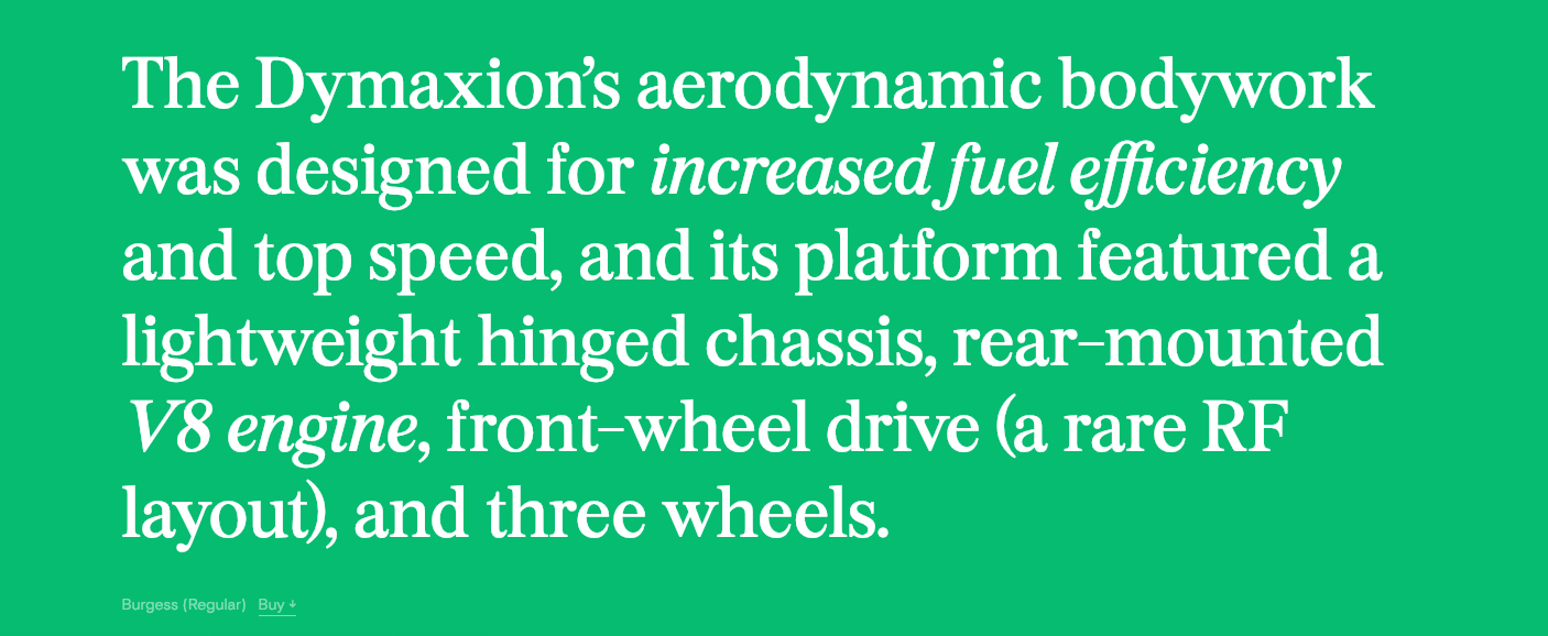
3. Burgess
Do you recognise elements of this typeface? It was actually inspired and loosely based on the classic font choice of
non-designers Times New Roman.
This new typeface was created by the Colophon Foundry and took five years to draw. It brings a classic style into the 21st century with softer curves and thicker strokes which make for a bolder typeface.
I personally love this modern twist on a traditional Serif. The designers have maintained the elegance and precision of the lines and details. Whilst also introducing a softer edge to the shapes and the result is no where near as angular and harsh.
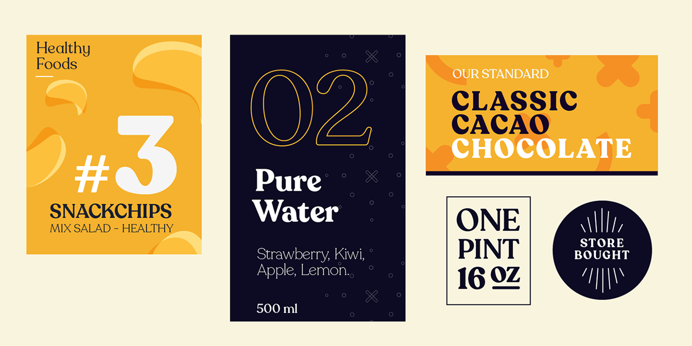
4. Recoleta
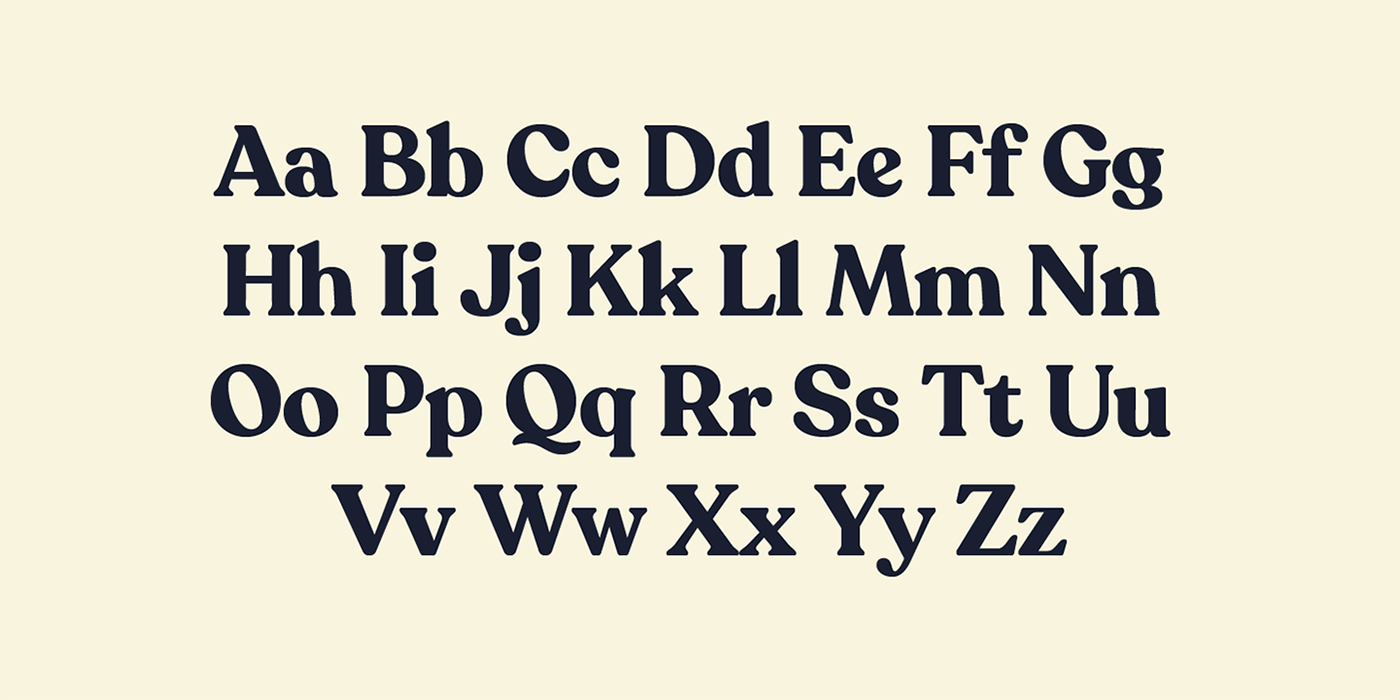
This is another Behance find. I love the style of this typeface, created for Latinotype. It was inspired by various styles from the 70's. So very different to the previous few styles we have looked at. What's really interesting though is that it's directly influenced by Cooper. The first typeface I listed in this post and was only released in 2018.
You can see the gentle rounded shapes in Cooper but mixed with harsher more slanted angles. The combination really works!
Again this typeface has a full family so a great choice for a bigger project where you need flexibility. Perhaps for a brand, magazine or even website design. It grabs your attention and is playful but still readable. However this typeface would not work particularly well as body copy. I would stick to titles, pull quotes and logos.
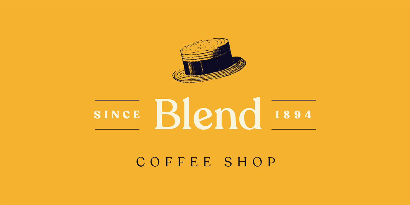
5. Saol
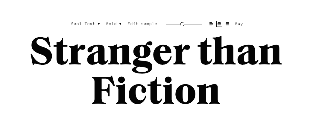
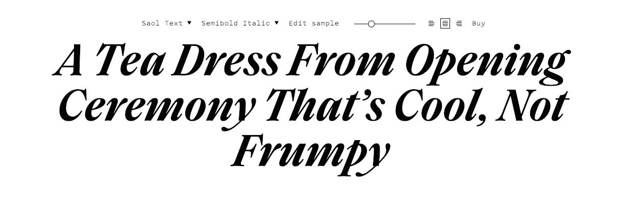
Saol revisits Victorian shapes, styles and lavish nature of typography which was classic of that time. In recent years Modernism has dominated the style of typefaces. Here we have a typeface which combines old calligraphic features from the late 1800's with the more modern proportions, strokes and lines we are used to seeing in modern typography.
This typeface has some very interesting angles and shapes especially on the letters 'n, m, h.'
These are just a section of the kinds of typefaces I expect to see more and more of in 2019...but there are plenty of other styles of Serif to check out. We would love to hear about your favourite finds!
Check out how designers are using type on sites like Behance, Dribble or Pinterest. Take a good look at all types of project including editorial, branding, animation etc and look for patterns.
If you fancy learning a bit more about type give this a try: 5 common Typography Mistakes To Avoid

Free email-course on the essentials

