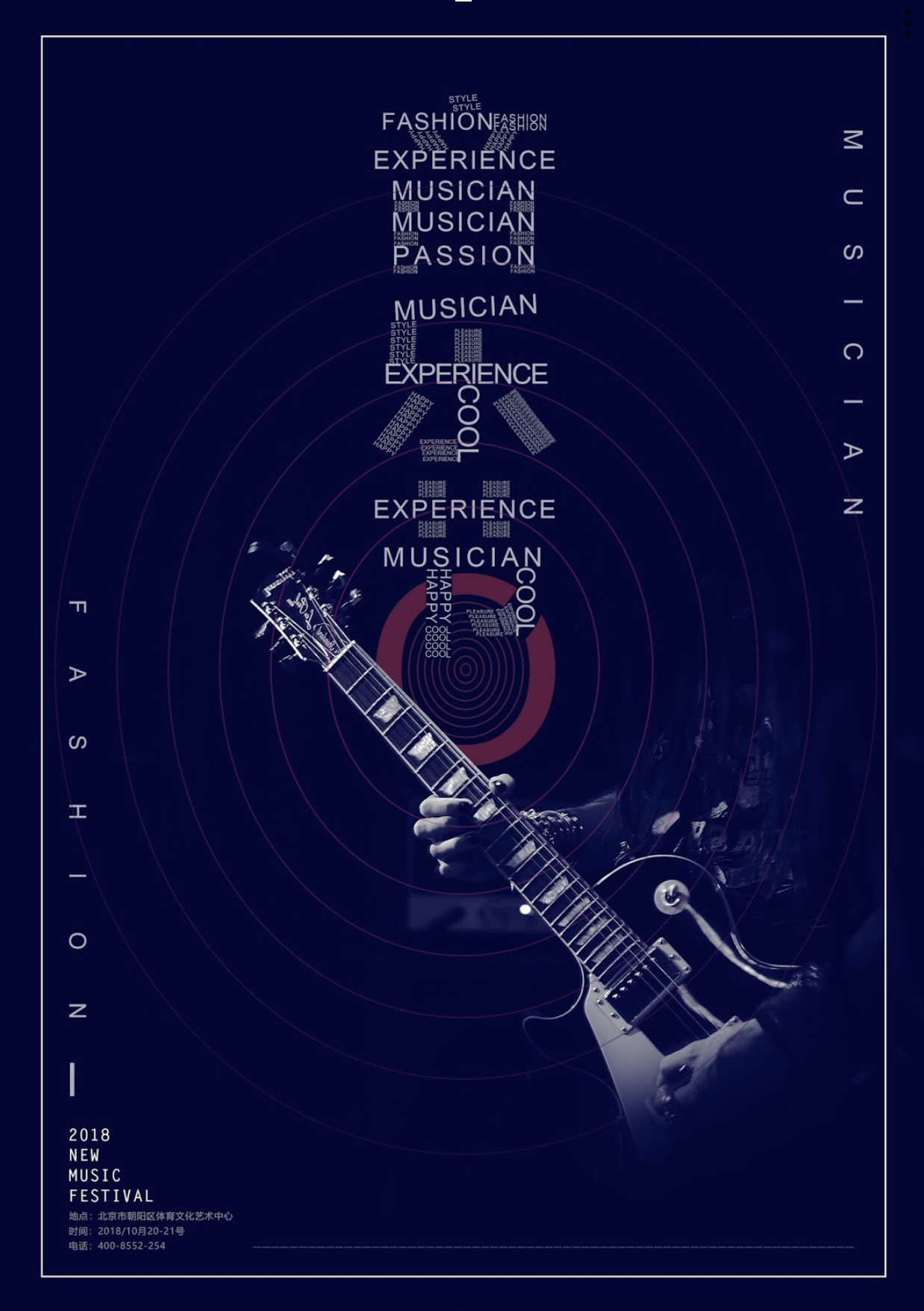
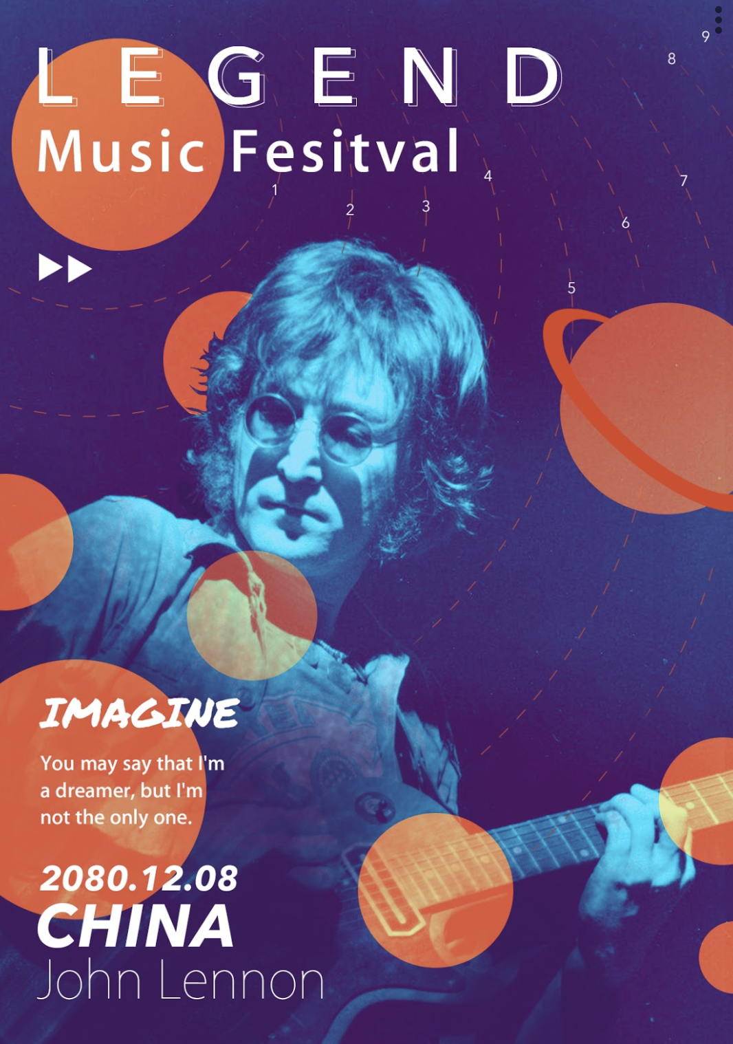
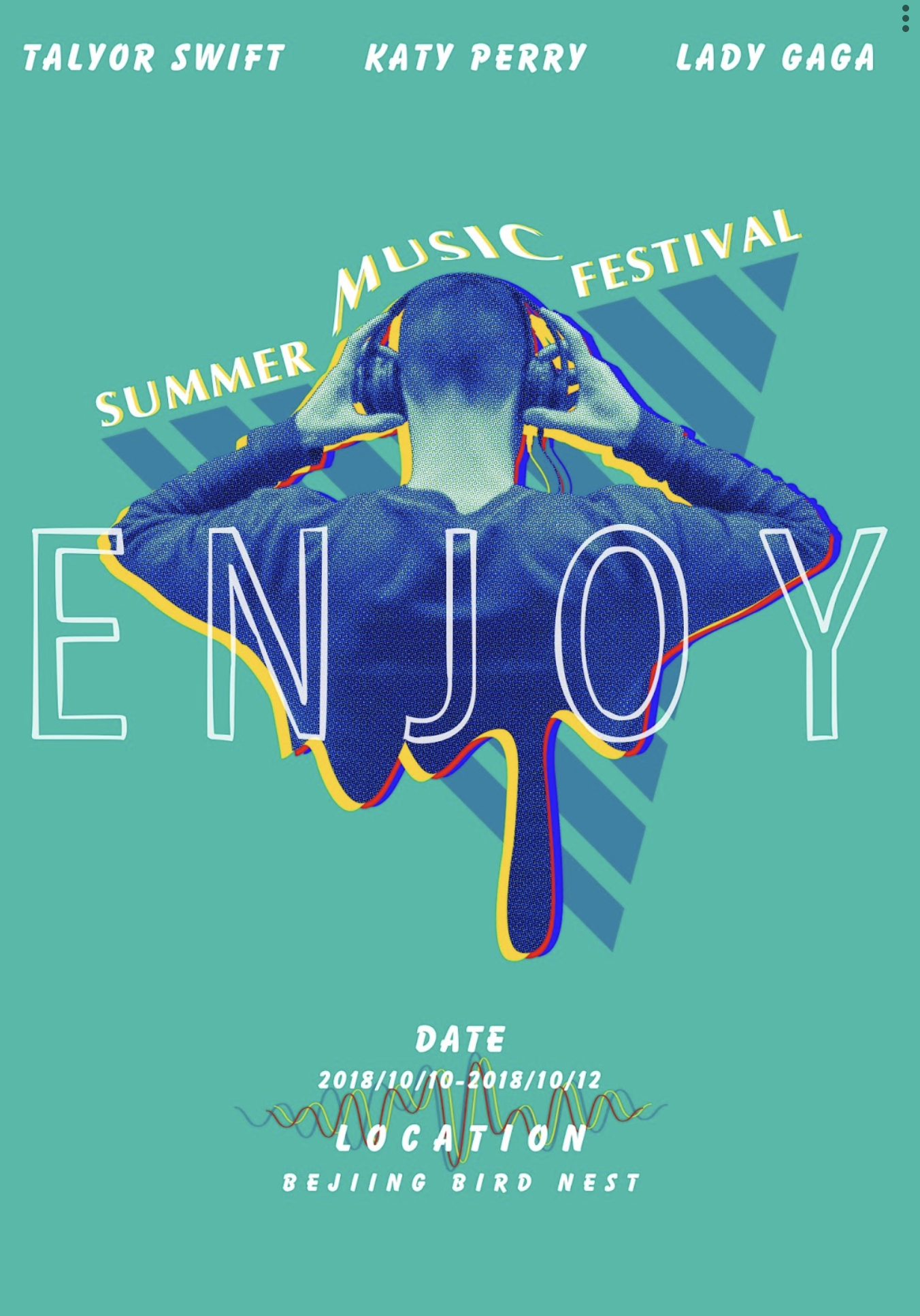
In this weeks YouTube video Martin reviews work from our students, discusses what's great and offers suggestions for improvements. This video is particularly useful if you are into poster or editorial design or if you want to get to grips with design theory!
YES has a global community of creative learners and we want to ensure as many people can engage with us and our brand as possible. We recently set a brief for our Chinese students through a native site which hosts and translates our courses.
The challenge was to Create a Music Festival Poster for a Summer Festival.
To see all of the submissions, learn from others work and see how colour, type, placement, hierarchy etc all effect the overall result of a piece work check out this video.
A few of the submissions
Amongst these designs is the winner and a few of the runner up designs. Discover the pro's and con's of each design and how they could get even better!
Or, if you don't fancy watching the video right now keep reading to learn a little more about the design principles discusses in the tutorial.
Layout & Composition
There are a lot of important techniques to be aware of when you are designing a poster or really any creative composition/design and if you fancy giving this brief a go yourself it might be handy to brush up the terms mentioned below.
1. Pairing Type
It can be tricky to know how to pair typefaces, especially when you are first starting out. The most important thing is not to use to many different typefaces, 2 is plenty enough. Usually one for the headings and another for the body copy.
When making your choices it's important they are not to similar, otherwise you might as well just use the same one right? There needs to be some contrast for them to work as a team. This one minute tutorial will show you some great examples.
If you are still feeling a little stuck another good rule of thumb is to pick a typeface with a large family like Gill Sans, Franklin Gothic etc and just skip a few weights. Try using thin and bold or regular and bold italic. This way you are still introducing contrast.
2. Dynamic Angles
Using angles in compositions and posters in particular can help to link information, create a sense of movement and generally draw more attention to a design. Usually you should use angles of 45°, 90° or 180° to help keep your work structured and orderly. However rules are made to be broken, these are only guides. Experiment with what you think will work.
3. Structuring Information
Creating a visual structure, otherwise known as a hierarchy for your information will ensure the viewer reads the most important pieces of information first so they don't end up confused by the design or its purpose.
Changing things like the size, colour, font and placement on the page will help you create a hierarchy. For instance if you are advertising a music event the name, time and date will all be the essential info. Then the line-up comes next and any additional information or instructions will need to be last thing the audience read.
4. Combining Colour
This is another tricky topic, especially if you are new to combining different colours in your designs. Again the most important thing is not to over do it. Too many different colours will leave a design looking confusing and unprofessional.
If you want to keep it simple and introduce contrast use two colour which sit opposite each other in the colour wheel. This is called a complimentary colour palette and although there are loads of more ways of combining colours this is a good place to start!
We hope you are enjoying our weekly YouTube videos and Blog Posts and would love to hear what you think if you have any thoughts of feedback!
If you fancy some more creative reading we have a great post on the Typography mistakes to avoid you might like.


