Join us as we share the first in a brand new series of video tutorials to help you learn creative Typography design. Each episode will focus on building a single letter of the alphabet using a specific style inspired by current digital lettering and illustration trends!
In this first tutorial, we will build the letter P from two intertwining tubes using Adobe Illustrator
Here is an overview of the design process!
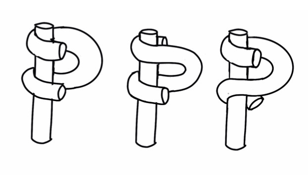
Start with sketches
It’s essential to start sketching to explore the style you want to use. Play around to see what works, and what looks best. The more you draw, the more the ideas will develop. Watch the video to learn why specific designs work better than others.
Create a vector illustration
Start by making the vertical tube using the rectangle tool and then tweak the shape using the pen tool and direct selection tool to round the ends to look more like tubes. You will also learn how to use a gradient to fill the tube and easily change the direction of the gradient, to best suit your design.
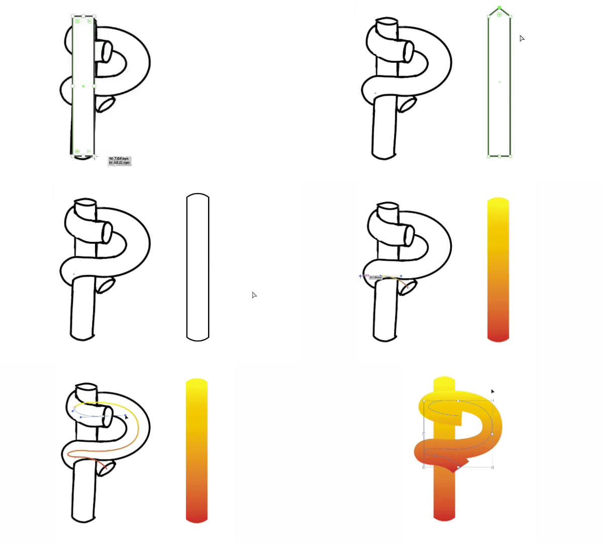
Use an opacity mask
For this design, we don’t want the letter to look flat, so we need to add the illusion of it being 3D by using an opacity mask and tweaking the gradient of the stroke. It’s also crucial to have a contrast between the two tubes.
Adding the opacity mask to the twisted tube helps to separate it from the vertical tube and creates the illusion of it coming in front and behind. Martin takes you through all the steps you need to follow to use the opacity mask to create the 3D illusion.
You will learn how to apply the mask, copy and paste the vertical tube within the mask and then to work backwards to selectively reveal the details that need to come in front of the vertical tube.
It sounds more complicated than it is – it’s pretty simple to create impressive 3D effects, once you learn the technique.
Add caps
The next step is to use the ellipse tool to draw the end of the tube caps and align them to the width of the tubes. Once you’ve created one, you can copy and rotate to the other instances.
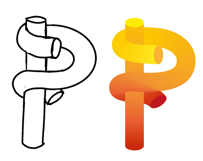
Adjust the contrast and make final alterations
It’s at this stage that we start to finalise the details. If there isn’t enough contrast, you can change the gradient stroke and move the gradient colour stops to get the best effect. It’s helpful to bear in mind that light comes from above, so if you are looking to create a natural result, the lighter colours should be nearer the top.
It is also now time to make final adjustments to things like the size of the end caps and make sure you are happy with the curve of the P.
Conclusion
We hope you like this introduction to designing fun and unique letters.
There are plenty more refinements that can be made such as adding reflections, highlights and shadows which we will be covering later in the series.

Are you interested in becoming a Graphic Designer or Illustrator?
Join 10,000+ creatives and subscribe to our FREE Graphic Design Survival Kit mini-course.
You’ll get instant access to a video+email course, our community + extra resources. Our beginner level free mini-course will be the perfect starting point for your design studies.
UP NEXT
Learn to work with Typography and create outstanding visuals that will turn you into a Photoshop Pro
LEARN ADOBE APPLICATIONS
from Adobe Certified Instructors and industry professionals


