Updated November 2024
Part 2: Color Harmonies and Perception
Welcome to the second part of our graphic design theory video about color theory. We will cover color harmonies, the 60-30-10 rule, the importance of understanding differences in perception of color, and how you can ensure your designs work for people with color blindness.
If you haven’t watched Part 1 yet, this link will take you there, then you can navigate back up using the arrow in the bottom left corner)
Ready to dive in and Part 2? Please click on the video below to watch our full tutorial! (9 min)
Color Harmonies
Let's take a look at some color pairing that work well together!
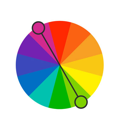
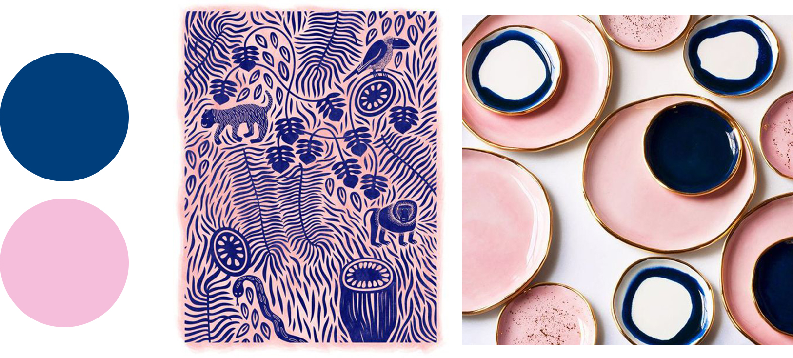
Complementary colors - Complementary colors are where you choose two colors on opposite sides of the color wheel. Using this color palette in a composition gives you a very striking result due to the high contrast between colors.
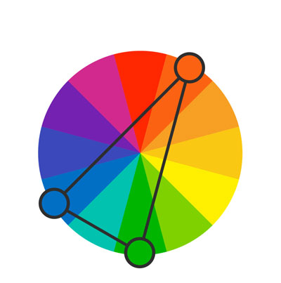
Split Complimentary - This is similar to complementary colors, but this time you choose a base color and then on the opposite side of the color wheel, choose the two adjacent colors to the base color’s complement. It’s still energetic but not quite as striking as complimentary.

Triad - The triad color scheme involves you drawing a triangle on the color wheel to select three colors. This creates quite a vibrant palette, so it’s best to use one color as the base color and the other two as supplementary colors, to allow a good balance.
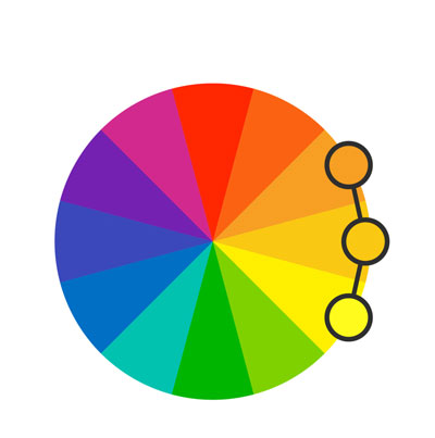
Analogous - For this color scheme, you pick colors adjacent to each other and rely on values, tones and shades to create contrast. This color palette is useful when you want to rely on the meaning of colors.

Tetradic - Here you pick four colors on a rectangle within the color wheel (essentially this can be divided into two complementary pairs). It’s more complicated than the other combinations, but if used well with a good balance between the colors, it can produce great compositions.

Monochromatic color scheme - This palette uses a single hue but combines different shades, tones and tints to create interest and attract attention.

Achromatic color scheme - Here you rely on different shades of grey. While you may think working with just black and white would create cold, menacing images, it’s not the case, and you can produce cute illustrations too.
Don’t forget to check out the video to see useful examples of all of these color combinations to help you get a better understanding of the different harmonies.
60-30-10 rule
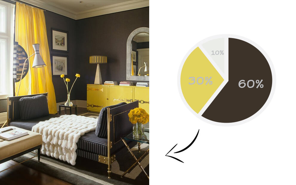
Originally used in interior design but can be used in your artwork and illustrations too! Here are some rules to follow!
Your base color should usually be a high chroma value or pure color and would make up around 60% of the composition.
Your supplementary color should make up approximately 30% of the composition.
An accent color that stands out, and would typically be a complementary color to your base color, makes up the final 10%.
Perception of color
As covered in the part 1 video, colors have different meanings, but it’s also important to take into account the demographic of the target audience. colors can be perceived differently by genders, by age groups and in different parts of the world. Click here for a quick refresh on color meanings!
Color blindness
Color blindness is the decreased ability to see the difference between colors. There are three main color blindness types, and these affect men more than women. It’s essential to understand how color blindness can impact your work, especially for typography, where it can affect legibility.
Color Oracle is a great free tool that can simulate the different color blindness types so you can add more contrast between colors.
Photoshop also has the two main types of color blindness as color proofing options (under proof setup in the view menu). You can use Cmd/Ctrl+Y to switch between a simulation of the selected color blindness.
If you head to this website, you can color blind proof your website by simply entering your URL and choosing the type of color blindness you wish to simulate.
Conclusion
Your choice of color can have a massive effect on your composition, and it’s vital to get a good understanding of the theory behind color to help you create designs that will appeal to your demographic and produce the intended impact!
If you haven’t watched part 1 yet, you can check it out here (15 min)
UP NEXT
Take a closer look at some of our favourite color combinations and explain the psychology behind them along with some tutorials to help you understand color theory!


