Contrast is probably one of the most important tools for designers and illustrators to make their work stand out and look professional. However, it can be tricky to get your head around what this term means and how to introduce it into your creative work.
Watch our latest tutorial to learn all about Contrast and how to master it like a pro!
What the term Contrast means:
When visual elements are in Contrast to one another, it means they're incredibly different from one another. There needs to be Contrast in your design to help draw the viewer's eye to the right place.
Let's take a look at Contrast in action.
Contrast in Size
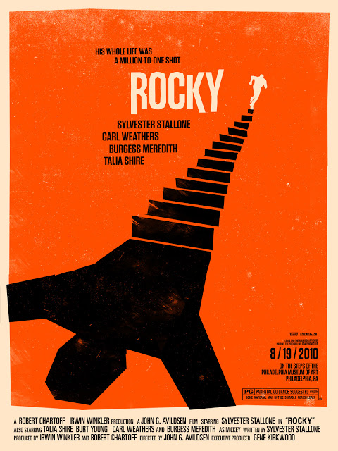
Introducing Contrast in the Size of your assets is an excellent way of making your design stand out! It will help to establish hierarchy and add visual interest.
Here are some great examples that use Size to add Contrast to Design.
Contrast in Color
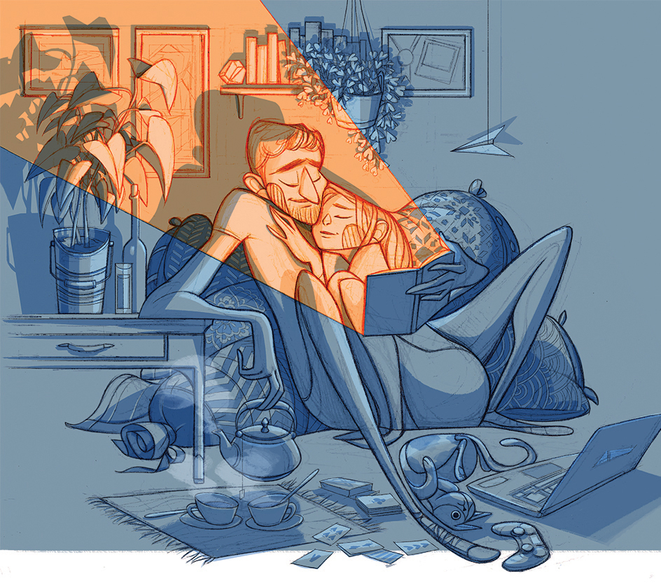
Here are some great tips to consider when using Color to add Contrast to your artwork!
- The maximum Contrast you can achieve is between Black and White.
- You don't want color pairings to feel uncomfortable, avoid using two colors that are too bright or too similar.
- Think about the tints and shades you are using! Don't pair two highly vibrant colors together, as it will be visually challenging for viewers.
- Use the color wheel as a guide to pairing colors that work well together, as these will create a perfect Contrast.
To learn more on Color and how to use it- check out the following tutorials!
Using contrasting shapes
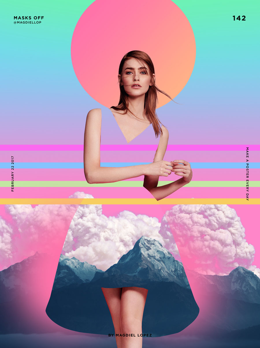
Using different shapes in your design will naturally introduce Contrast; however, using too many shapes can leave your design looking cluttered and unprofessional.
Here are some more pointers to consider when working with Shapes!
- Similar to Size, using Shape can help to draw the viewers attention to the vital element.
- If you have many Geometric Shapes, introducing one Organic Shape which will immediately make it stand out. This can be particularly helpful in poster and editorial design, where you are working with lots of images and frames.
- Shapes can be used to stylise and add visual interests to your artwork.
Contrast in Typography
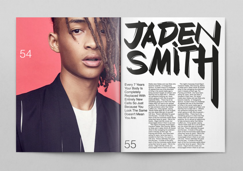
Using different Typefaces is a quick and effective way to introduce Contrast. Here are some valuable tips to consider:
- Think about adding Contrast with type when working with a lot of copy, especially in Editorial projects.
- As a general rule of thumb, you don't want to use the same font throughout your design. Nothing will stand out, and it may appear too plain.
- Using multiple weights within a font family is also a great idea as it ensures consistency, creates a hierarchy of information, and breaks up the design.
- It's easy to fall into the trap of using too many different fonts, Typically more than 2 or 3 is unnecessary as your design will be overly complex and difficult to read.
To learn more on Typography and how to use it- check out the following tutorials!
UP NEXT
Explore compositional techniques in graphic design; you will learn about design principles, design theory and in general rules to follow on your next project


