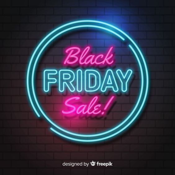
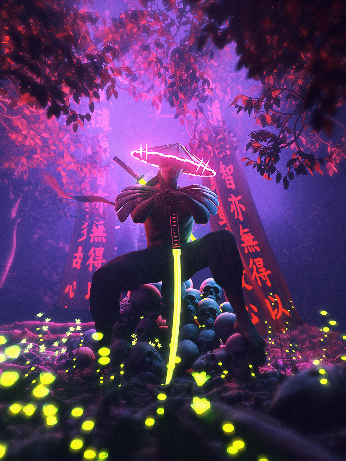
The Neon Light Effect, primarily used for signage to attract customers (think Las Vegas or Palm Spring Motels), is also now widely used commercially.
On our 2020 Trend Blog post, we predicted to see a revival of Neon Light and Retro Futurism style emerging. Today we will showcase 5 Neon Light style that will blow your mind and, most importantly, teach you many techniques on how to create Neon Light Effects!
1. Neon Effect Animation
We love this advertisement for Audi, which represents a colorful futuristic world using Neon Effect and Animation. View full project
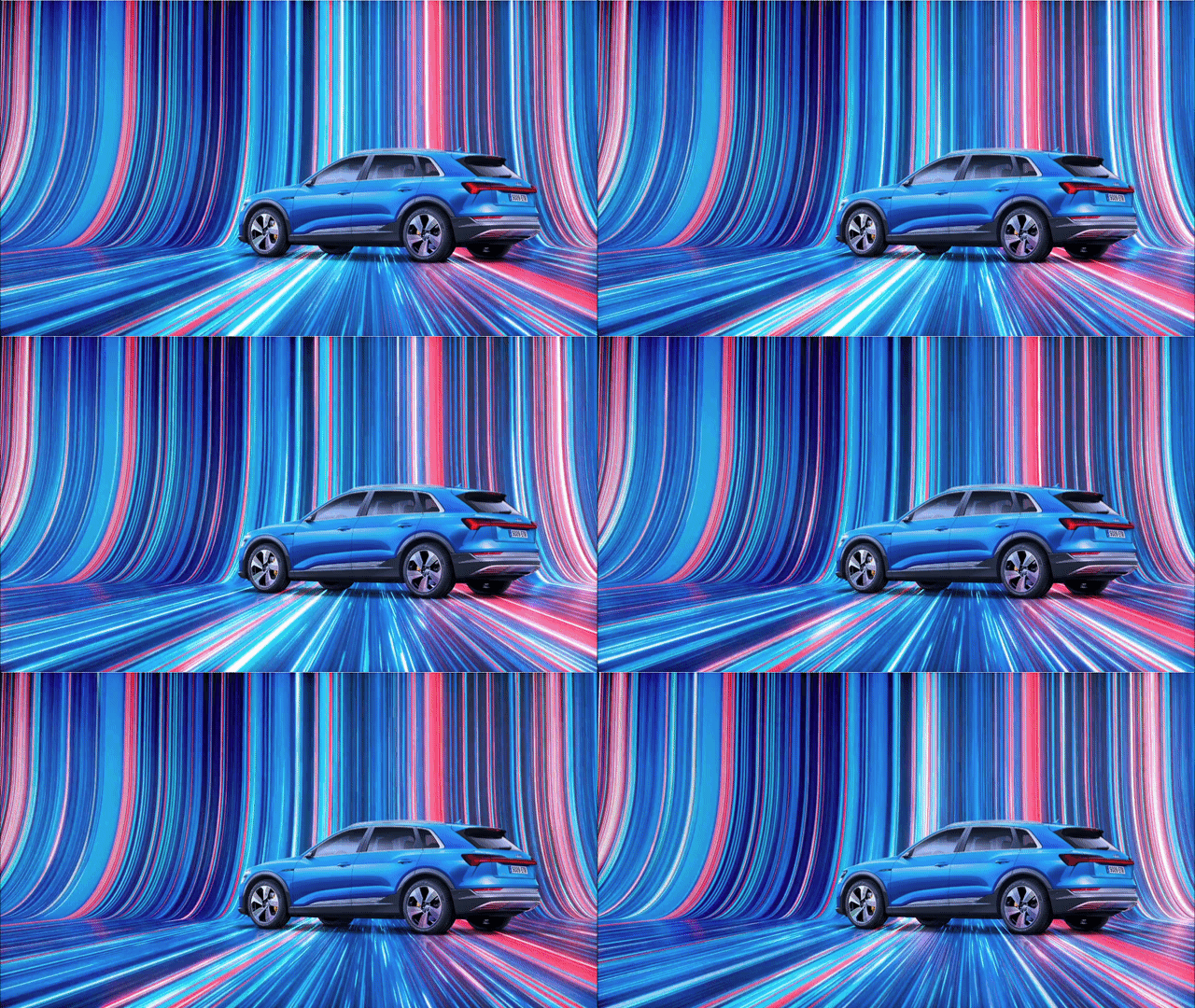
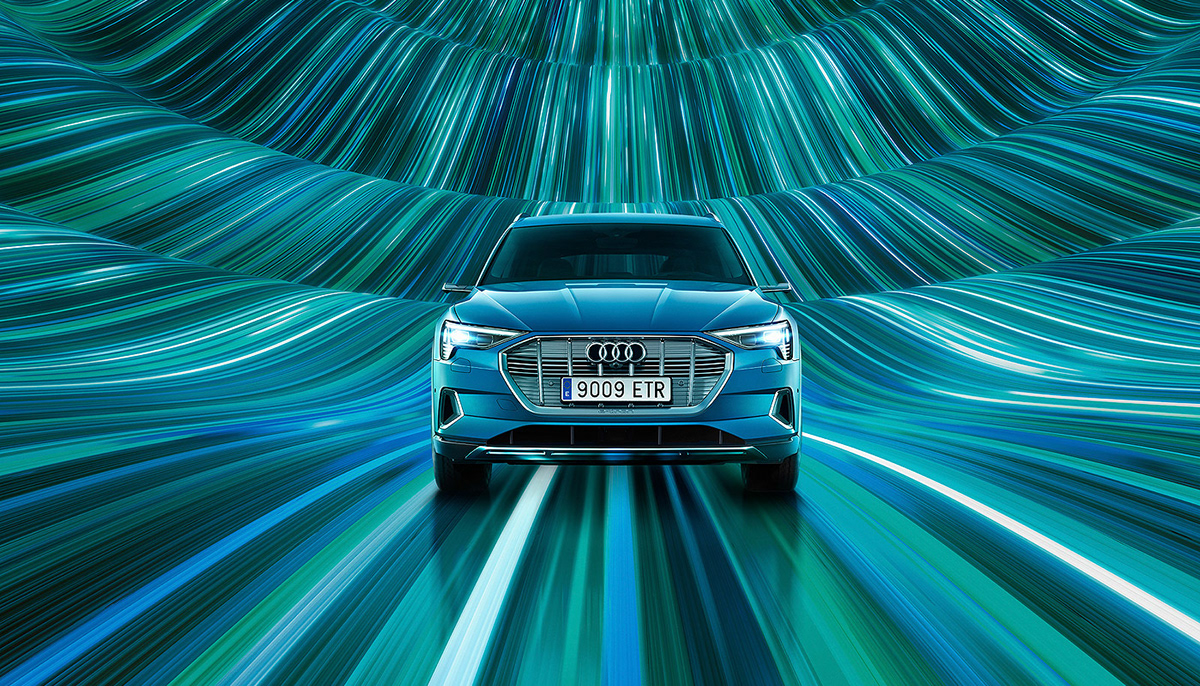
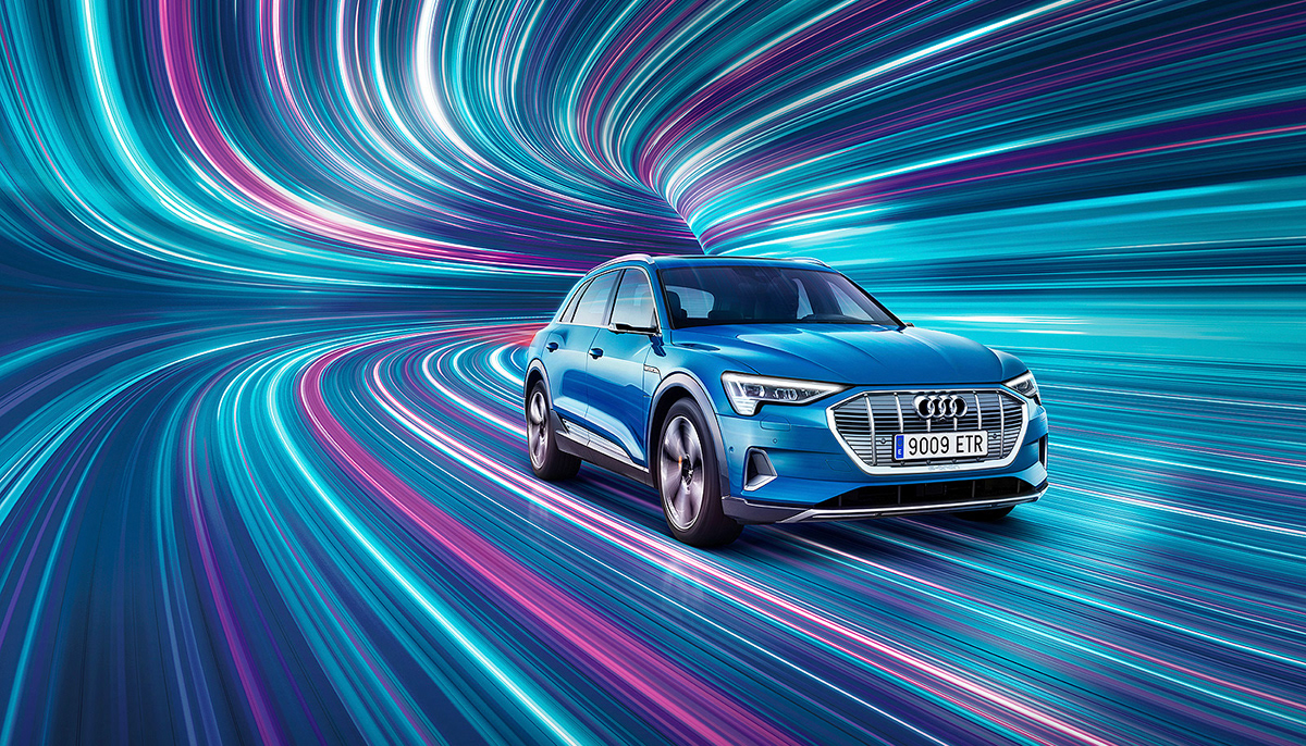
We have seen a massive increase in the use of Animation across all types of creative projects and especially within branding and identity! So understanding how to use this technique could come in very handy on future projects!
If you want to learn a simple method for animating your Layer Styles using the Timeline Panel? Watch our tutorial below and create some fantastic results!
2. Abstract Dynamic Background
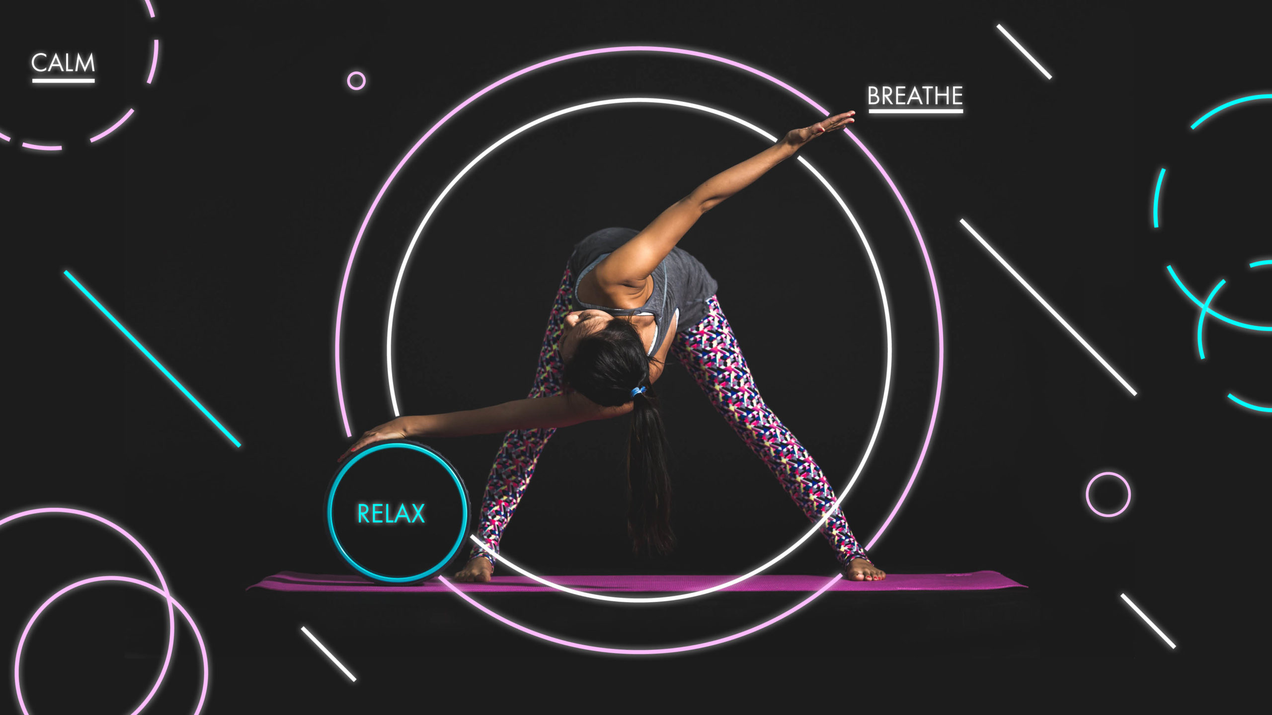
Ever wanted to create a Neon Background Effect in InDesign? Yes InDesign has many cool creatives features too. Discover how to make great use of the Outer Glow effect to create a Neon Effect.
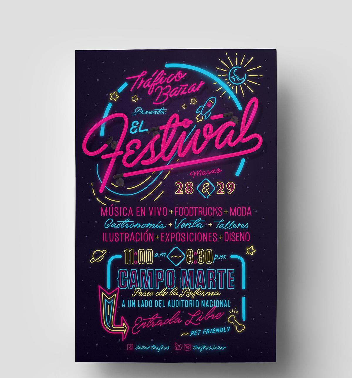
3. Neon Typography
Aside from Neon Type as a signage for shops and restaurants, many designers have also used Neon Type for Web design, Print and Motion Graphics.
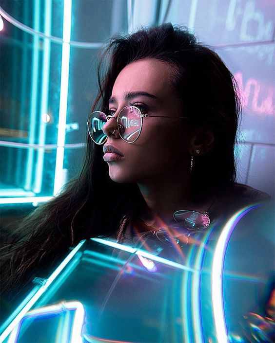
4. Neon Photography
Neon Photography style has become very popular, although Photographers do the hard job in shooting them with actual Neon Lights. The Photographs do still require a lot of editing using either Adobe Photoshop and Adobe Lightroom.
5. Neon Portrait
Last but not least, Our favorite style, the Neon Portrait Effect. If you are ready to make your portrait illuminated by Neon effect? Watch our step by step video tutorial!
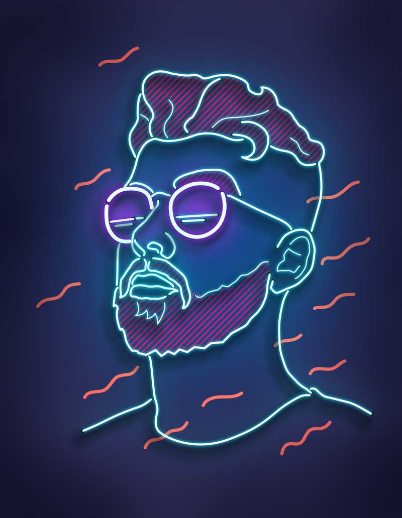
For BEST practice, follow these tips!
1. Choose a good quality, clean portrait. We used Unsplash Stock image for this tutorial.
2. When using the Pen tool, have a mixture of thin and thick lines
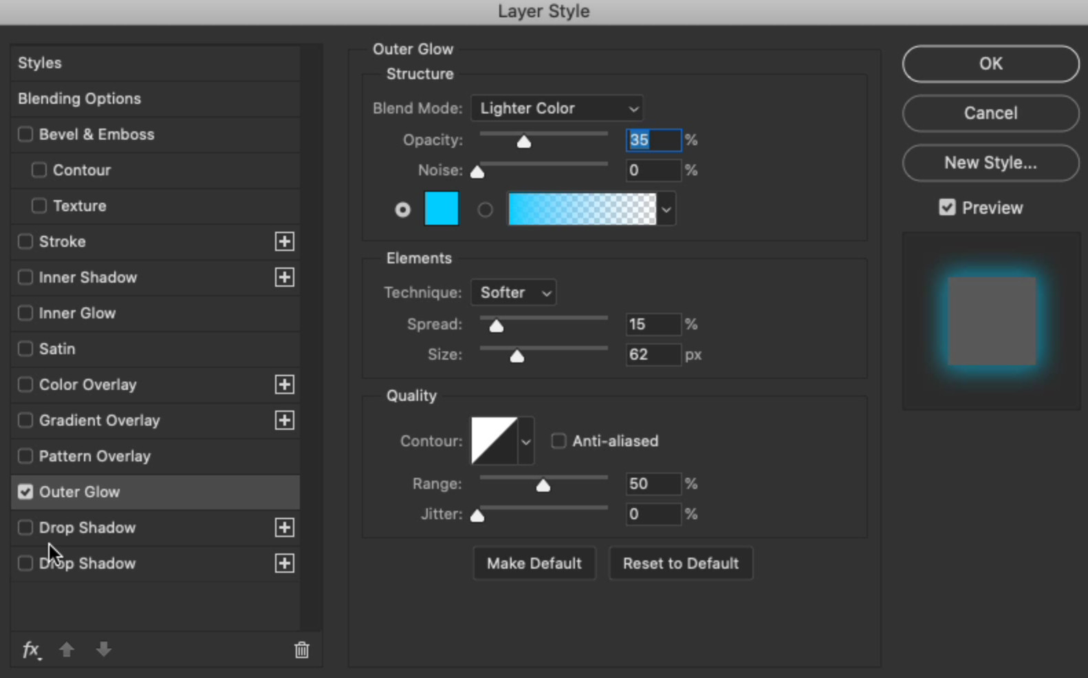
3. Use Layer Styles Outer Glow to apply Neon Effect - We used the following settings:
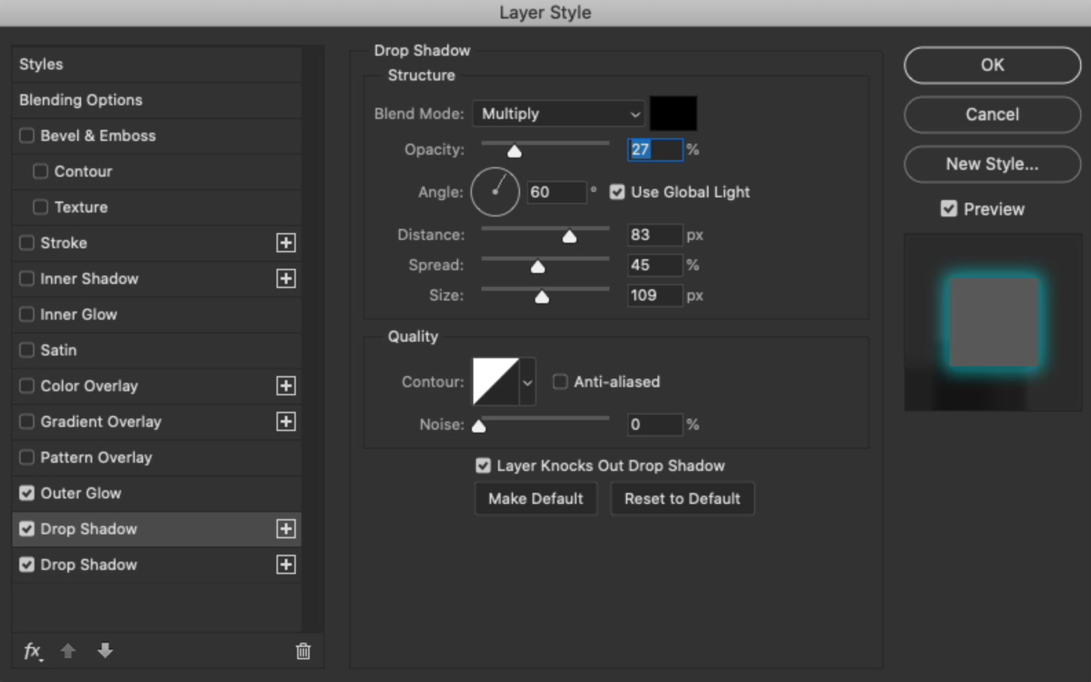
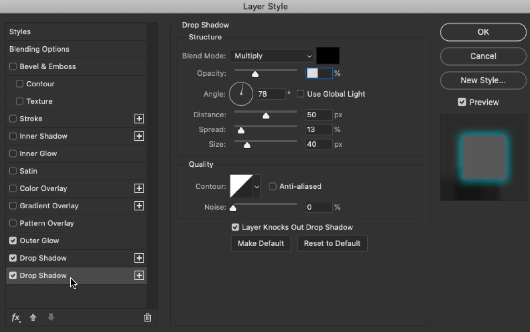
4. Use a mix of soft and hard drop shadows- We used the following settings:
5. The Neon Effect looks best on a darker background-color
We hope you enjoyed this tutorial. If you follow along, then be sure to tag us or use #yesimadesigner on Instagram so we can check it out!
UP NEXT
We are back with another extensive list of our Graphic Design Trend Predictions for 2020.

